
Showing posts with label blog. Show all posts
Showing posts with label blog. Show all posts
Monday, August 13, 2012
Beautiful Heart Shape Shared Buttons for your Blog

Lets see how to add it to your blog.
Backup your template before editing your template.
* Go to Template > Edit HTML > find the </head> tag
* Copy and Paste the following code Above / Before </head> tag
<!-- Start Heart Bookmarking Gadget Code -->
<script src='http://w.sharethis.com/gallery/shareegg/shareegg.js' type='text/javascript'/>
<script src='http://w.sharethis.com/button/buttons.js' type='text/javascript'/>
<script type='text/javascript'>stLight.options({publisher: "ur-98d377f-bdd3-9ad1-fbe5-2a678f0a60ee", onhover:false}); </script>
<link href='http://w.sharethis.com/gallery/shareegg/shareegg.css' media='screen' rel='stylesheet' type='text/css'/>
<!-- End Heart Bookmarking Gadget Code -->
* Now find the </body> tag and Copy/Paste the below Code Above / Before </body> tag
<!-- Start Heart Share Code -->
<div style='position: fixed; bottom: 2%; right: 12%;'>
<div class='shareEgg' id='shareThisShareHeart'/>
</div>
<script type='text/javascript'>stlib.shareEgg.createEgg('shareThisShareHeart', ['facebook','twitter','pinterest','linkedin','stumbleupon','email','sharethis'], {title:' <data:blog.pageTitle/>',url:'<data:blog.url/>',theme:'shareheart'});</script>
<!-- End Heart Share Code -->
Note: You can change the location of the Heart by editing the values of bottom: 2%; left: 2%;(which is in red color)
* Save your template.
That's it.
Sunday, August 12, 2012
Css Blend Style Menu Bar For Blogger
This is also nice hover style menubar, Its color
like blend style. This menubar not include
drop down feature,But this will more attractive
for dark color blogger templates.Earlier also i
posted about css menubar its also similar to this.
Attractive Css Drop Down Menu Bar For Blogger

Demo
1. Log in to blogger account and Go to Design >> Edit HTML
(make sure backup your template first)
2. Put checked marked in Expand Widget Templates
3. Find this tag by using Ctrl+F </head>
4. Paste below code Before </head> tag
5. Now Find this code by using Ctrl+F <div id='content-wrapper'>
6. Paste below code Before <div id='content-wrapper'> code
*Replace # With your URL
*Replace Name with as your like.
7. Now save your template
you are done.
1. Log in to blogger account and Go to Design >> Edit HTML
(make sure backup your template first)
2. Put checked marked in Expand Widget Templates
3. Find this tag by using Ctrl+F </head>
4. Paste below code Before </head> tag
<style>
*{padding:0; border:0; margin:0;}
#default a,
#example a{
display:block;
width:90px;
height:46px;
margin-right:3px;
float:left;
background-image:url(https://blogger.googleusercontent.com/img/b/R29vZ2xl/AVvXsEjRE-cpBoK8_3nvZ2zvWHG5PX0b7mXC_T4vRnU1QzJAQLloV3I243UOJ_Lx0NCpbMJJ6qNwDfZST3AsRZyZhifQU2TcmJQvNhjskDuAki9Uau1Em9jFZ0IJtMIs7Hw7pYQ-3t48yPLIbcY/s1600/nav-sprite.png);
background-repeat:no-repeat;
cursor:pointer;
text-indent:-9999px;}
#example_home{background-position:0 0;}
#example_home:hover,#example_home.hover{background-position:0 -48px;}
#example_blog{background-position:-90px 0;}
#example_blog:hover,#example_blog.hover{background-position:-90px -48px;}
#example_demo{background-position:-180px 0;}
#example_demo:hover,#example_demo.hover{background-position:-180px -48px;}
#example_about{background-position:-270px 0;}
#example_about:hover,#example_about.hover{background-position:-270px -48px;}
#example_services{background-position:-360px 0;}
#example_services:hover,#example_services.hover{background-position:-360px -48px;}
#example_contact{background-position:-450px 0;}
#example_contact:hover,#example_contact.hover{background-position:-450px -48px;}
</style>
<script src='http://ajax.googleapis.com/ajax/libs/jquery/1.7.0/jquery.min.js'/>
<script src='jquery.blend.js'/>
<script>
$(document).ready(function(){
$("#example a").blend();
$("#example2 a").blend();
});
</script>
5. Now Find this code by using Ctrl+F <div id='content-wrapper'>
6. Paste below code Before <div id='content-wrapper'> code
<div id='demo'>
<div id="example">
<a href="#" id="example_home">Home</a>
<a href="#" id="example_blog">Blog</a>
<a href="#" id="example_demo">Demo</a>
<a href="#" id="example_about">About</a>
<a href="#" id="example_services">Services</a>
<a href="http://www.bloggertrix.com/" id="example_contact">Add This</a>
</div></div>
*Replace # With your URL
*Replace Name with as your like.
7. Now save your template
you are done.
Blogger Labels / Category With Cool Css3 Style
This is also cool trick for change your
blogger labels, category with nice style.
you can see below image. Its looks so
great,Earlier i posted about same trick
Change Blogger Label Links As Brick/ Box Style. Follow below steps to add it
to your blog.

1. Log in to blogger account & Go to Design >> Edit HTML
2. Find this code by using Ctrl+F ]]></b:skin>
3.Paste below code Before ]]></b:skin> code
4. Now Click Save Template.
You are done...
1. Log in to blogger account & Go to Design >> Edit HTML
2. Find this code by using Ctrl+F ]]></b:skin>
3.Paste below code Before ]]></b:skin> code
.label-size {
    float: left;
    margin: 0 0 7px 20px;
    position: relative;
    font-family: 'Helvetica Neue', Helvetica, Arial, sans-serif;
    font-size: 0.75em;
    font-weight: bold;
    text-decoration: none;
    color: #996633;
    text-shadow: 0px 1px 0px rgba(255,255,255,.4);
    padding: 0.417em 0.417em 0.417em 0.917em;
    border-top: 1px solid #d99d38;
    border-right: 1px solid #d99d38;
    border-bottom: 1px solid #d99d38;
    -webkit-border-radius: 0 0.25em 0.25em 0;
    -moz-border-radius: 0 0.25em 0.25em 0;
    border-radius: 0 0.25em 0.25em 0;
    background-image: -webkit-linear-gradient(top, rgb(254, 218, 113), rgb(254, 186, 71));
    background-image: -moz-linear-gradient(top, rgb(254, 218, 113), rgb(254, 186, 71));
    background-image: -o-linear-gradient(top, rgb(254, 218, 113), rgb(254, 186, 71));
    background-image: -ms-linear-gradient(top, rgb(254, 218, 113), rgb(254, 186, 71));
    background-image: linear-gradient(top, rgb(254, 218, 113), rgb(254, 186, 71));
    filter: progid:DXImageTransform.Microsoft.gradient(GradientType=0,StartColorStr='#feda71', EndColorStr='#feba47');
    -webkit-box-shadow: inset 0 1px 0 #faeaba,
        0 1px 1px rgba(0,0,0,.1);
    -moz-box-shadow: inset 0 1px 0 #faeaba,
        0 1px 1px rgba(0,0,0,.1);
    box-shadow: inset 0 1px 0 #faeaba,
        0 1px 1px rgba(0,0,0,.1);
    z-index: 1;
}

.label-size:before {
    content: '';
    width: 1.30em;
    height: 1.39em;
    background-image: -webkit-linear-gradient(left top, rgb(254, 218, 113), rgb(254, 186, 71));
    background-image: -moz-linear-gradient(left top, rgb(254, 218, 113), rgb(254, 186, 71));
    background-image: -o-linear-gradient(left top, rgb(254, 218, 113), rgb(254, 186, 71));
    background-image: -ms-linear-gradient(left top, rgb(254, 218, 113), rgb(254, 186, 71));
    background-image: linear-gradient(left top, rgb(254, 218, 113), rgb(254, 186, 71));
    filter: progid:DXImageTransform.Microsoft.gradient(GradientType=1,StartColorStr='#feda71', EndColorStr='#feba47');
    position: absolute;
    left: -0.69em;
    top: .2em;
    -webkit-transform: rotate(45deg);
    -moz-transform: rotate(45deg);
    -o-transform: rotate(45deg);
    transform: rotate(45deg);
    border-left: 1px solid #d99d38;
    border-bottom: 1px solid #d99d38;
    -webkit-border-radius: 0 0 0 0.25em;
    -moz-border-radius: 0 0 0 0.25em;
    border-radius: 0 0 0 0.25em;
    z-index: 1;
}

.label-size:after {
    content: '';
    width: 0.5em;
    height: 0.5em;
    background: #fff;
    -webkit-border-radius: 4.167em;
    -moz-border-radius: 4.167em;
    border-radius: 4.167em;
    border: 1px solid #d99d38;
    -webkit-box-shadow: 0 1px 0 #faeaba;
    -moz-box-shadow: 0 1px 0 #faeaba;
    box-shadow: 0 1px 0 #faeaba;
    position: absolute;
    top: 0.667em;
    left: -0.083em;
    z-index: 9999;
}

#Label1 {
    height: 210px;
}

.label-size:hover {
    background-image: -webkit-linear-gradient(top, rgb(254, 225, 141), rgb(254, 200, 108));
    background-image: -moz-linear-gradient(top, rgb(254, 225, 141), rgb(254, 200, 108));
    background-image: -o-linear-gradient(top, rgb(254, 225, 141), rgb(254, 200, 108));
    background-image: -ms-linear-gradient(top, rgb(254, 225, 141), rgb(254, 200, 108));
    background-image: linear-gradient(top, rgb(254, 225, 141), rgb(254, 200, 108));
    filter: progid:DXImageTransform.Microsoft.gradient(GradientType=0,StartColorStr='#fee18d', EndColorStr='#fec86c');
    border-color: #e1b160;
}

.label-size:hover:before {
    background-image: -webkit-linear-gradient(left top, rgb(254, 225, 141), rgb(254, 200, 108));
    background-image: -moz-linear-gradient(left top, rgb(254, 225, 141), rgb(254, 200, 108));
    background-image: -o-linear-gradient(left top, rgb(254, 225, 141), rgb(254, 200, 108));
    background-image: -ms-linear-gradient(left top, rgb(254, 225, 141), rgb(254, 200, 108));
    background-image: linear-gradient(left top, rgb(254, 225, 141), rgb(254, 200, 108));
    filter: progid:DXImageTransform.Microsoft.gradient(GradientType=1,StartColorStr='#fee18d', EndColorStr='#fec86c');
    border-color: #e1b160;
}
4. Now Click Save Template.
You are done...
Change Blogger Label Links As Brick / Box Style
In this tutorial im going to explain, how to add
brick or box style for label gadget in blogger.
Actually,this is a cool style for your blog.
Most of your visitors like it. And view your more
categories.You can apply it to your blog with
easy steps, you can try it.

1. Log in to blogger account & Go to Design >> Edit HTML
2. Find this code by using Ctrl+F ]]></b:skin>
3.Paste below code Before ]]></b:skin> code
You are done...
1. Log in to blogger account & Go to Design >> Edit HTML
2. Find this code by using Ctrl+F ]]></b:skin>
3.Paste below code Before ]]></b:skin> code
#Label1 a{
color:#333;
padding:2px 8px;
line-height:24px;
margin:0 2px;
background:#eee url(https://blogger.googleusercontent.com/img/b/R29vZ2xl/AVvXsEjn0e_KvffKHiZBmFsm2GmcpzJiTA0yT7fMlHpmW9R7cQN_iJtifpPV7Q9UjdmyiHNIGZfNcOolhhzGQhK3P_qpNp02_2sg44SC-5NbfkDuggBDtYud_GtBL37U0PArnKxE9PMdStogJtk/s1600/bricks.png) center center repeat-x;
border:1px solid #ddd;
-webkit-border-radius:6px;
-moz-border-radius:6px;
border-radius:6px;
font-size:10px !important;
text-decoration:none;}
#Label1 a:hover{
color:#666;
background:none #fff;
text-decoration:none;}
4. Now Click Save Template.You are done...
How to add floating social subscribe buttons for blogger
This is a cool unique subscribe gadget with nice buttons.
Add to your blog and make it attractive.
 1. Log in to blogger and Go to Design >> Page Element.
2. Click Add Gadget and select 'HTML/Javascript'
3.Paste below code.
* Repalce facebook profile url with your URL
* Repalce your twitter username with your URL
* Replace YOURFEEDNAME with your feed name
* Replace yourfeedname with your feed name
4. Now save your HTML/Javascript'.
you are done.
2. Click Add Gadget and select 'HTML/Javascript'
3.Paste below code.
<div style='position: fixed; bottom: 1%; right: 1%;'>
<table border="0"><tr><td>
<a href='facebook profile url' target="_blank"><img alt="Find Us On Facebook" border="0"style='background:transparent;border:none;' title='like us on facebook' src="https://blogger.googleusercontent.com/img/b/R29vZ2xl/AVvXsEgwOcVkLy8SSNvj-fX46vJ9hB_YjYeIXCYrB_-3rvJVMTYXFK5_Fu4yFsqjiHaeX92pY7sN6J39n2mdKq5D_YpJ-1CdWx6BqM5OqgjE1rjZz4rlKY_7iV1xEFjEgUCPs7o-EPHyOxcwe-w/s1600/facebook-icon.png" /></a>
<a href='http://twitter.com/your twitter username' target="_blank"><img alt="Follow Us On Twitter" border="0"style='background:transparent;border:none;' title='follow us on twitter' src="https://blogger.googleusercontent.com/img/b/R29vZ2xl/AVvXsEjiG0swDN-j66lGaZfHaCMAJxeA6xOWnQh4gTMIbNH3-DEHW7Z8qj-xKX7BdNtRNGH4DeFbqxOlPcOLNLa9aAGPVDgxdtckoyJ_KMQwO16p4yAWrbt1DmEXptcH7hjkBVYXuupUJ-5_gVc/s1600/twitter-icon.png" /></a>
<a href="http://feeds.feedburner.com/YOURFEEDNAME" target="_blank"><img alt="Rss Feed Options" border="0"style='background:transparent;border:none;' title='subscribe us' src="https://blogger.googleusercontent.com/img/b/R29vZ2xl/AVvXsEi-NR6-pKCG-ulXyZoy-6VzM2OgmI2rSa3eiwtCbENRK-bteyavlimodg1HCNyMkgOz3yRkiaK3E1YfwCJ7EUMkr1yKHCK8pJCZcQn2dRzG55URaqxhLHG3wOfMi27sO6dBLx-xr8Eh90w/s1600/rss-icon.png" /></a>
<a href='http://feedburner.google.com/fb/a/mailverify?uri=yourfeedname&loc=en_us' target="_blank"><img alt="Subscribe Via Email Rss" border="0" style='background:transparent;border:none;' title=' email subscribe'src="https://blogger.googleusercontent.com/img/b/R29vZ2xl/AVvXsEhMdoisNmRI-TuzuRHN_WaJZslVr__O_QRn6Siq2Dpx42Nbi3dCBzUvQuYBleEQazHAlppzbDpTmOdxifIxbHQr7cewEh1AaeE4vDEf09shXrqJ_TB6yB0YuuS6VrtEI7iCE5kEp7XtrrQ/s1600/rss-mail.png" /></a>
</td><td>
</td></tr></table>
<div style="clear: both;font-size: 8px;text-align:center;margin-top:-10px;"><a href="http://ehowportal.blogspot.com/2011/05/how-to-add-floating-social-media.html"><p>Get this</p></a></div>

</div>
* Repalce facebook profile url with your URL
* Repalce your twitter username with your URL
* Replace YOURFEEDNAME with your feed name
* Replace yourfeedname with your feed name
4. Now save your HTML/Javascript'.
you are done.
Add Cool Css Sprites Menu For Blogger
This is cool sprite menu style. It work with Firefox 3.5, IE 7, Chrome 3.0 & Opera 9.02 Its look very attractive.I include 4 style menu.You can make attractive your blog. Its easy to add it to your blog.Follow below simple steps. Earlier i created more horizontal menubars, click below links to view all. most of are includewith demo.
Menubar Collection
 1. Log in to blogger account and Go to Design >> Edit HTML
2. Put checked marked in Expand Widget Templates
3. Find this code by using Ctrl+F <div id='content-wrapper'>
4. Paste below code Before <div id='content-wrapper'> code
*Replace # With your URL
5. Find this tag by using Ctrl+F ]]></b:skin>
6. Paste below one of code Before ]]></b:skin> tag (choose a style as your like.)
Style 1
Style 2
Menubar Collection
2. Put checked marked in Expand Widget Templates
3. Find this code by using Ctrl+F <div id='content-wrapper'>
4. Paste below code Before <div id='content-wrapper'> code
<div class="bloggertrix-navi1">
  <ul>
    <li class="sm1"><a href="#"></a></li>
    <li class="sm2"><a href="#"></a></li>
    <li class="sm3"><a href="#"></a></li>
    <li class="sm4"><a href="#"></a></li>
    <li class="sm5"><a href="http://www.bloggertrix.com/"></a></li>
  </ul>
</div>
*Replace # With your URL
5. Find this tag by using Ctrl+F ]]></b:skin>
6. Paste below one of code Before ]]></b:skin> tag (choose a style as your like.)
Style 1
/*menubar by bloggertrix.com */
.bloggertrix-navi1 {
    display:block;
    height:72px;
    margin:30px auto;
    position:relative;
    width:525px; }
.bloggertrix-navi1 ul {
    float:none;
    list-style-image:none;
    list-style-type:none;
    margin:3px 0; }
.bloggertrix-navi1 ul li {
    background-image:url(https://blogger.googleusercontent.com/img/b/R29vZ2xl/AVvXsEhXbBWw7rf_8jZS05fHVHa-G0lB9xNHghytDZqpRTrj0kqt8UPUW0k3qgMAM6LxwHOgJ_g8x1Mwcvw59wEj776kfDY6PcUwJ969Aq6hzTCe7hgKcdR8lqyWefoU-1Qy0zuyNNR8C_KfQa4/s1600/bloggertrix.com-tab-1.png);
    background-repeat:no-repeat;
    float:left;
    height:72px;
    margin:0px;
    padding-top:5px;
    position:absolute; }
.bloggertrix-navi1 ul li a {
    display:block;
    height:100%;
    width:100%; }
.bloggertrix-navi1 ul li.sm1 {
    background-position:0 0;
    left:0px;
    width:125px; }
.bloggertrix-navi1 ul li.sm2 {
    background-position:-125px 0;
    left:100px;
    width:124px; }
.bloggertrix-navi1 ul li.sm3 {
    background-position:-249px 0;
    left:200px;
    width:124px; }
.bloggertrix-navi1 ul li.sm4 {
    background-position:-373px 0;
    left:300px;
    width:125px; }
.bloggertrix-navi1 ul li.sm5 {
    background-position:-498px 0;
    left:400px;
    width:126px; }
.bloggertrix-navi1 ul li:hover {
    z-index:1000; }
.bloggertrix-navi1 ul li.sm1:hover {
    background-position:0 -75px; }
.bloggertrix-navi1 ul li.sm2:hover {
    background-position:-125px -75px; }
.bloggertrix-navi1 ul li.sm3:hover {
    background-position:-249px -75px; }
.bloggertrix-navi1 ul li.sm4:hover {
    background-position:-373px -75px; }
.bloggertrix-navi1 ul li.sm5:hover {
    background-position:-498px -75px; }
/*menubar by bloggertrix.com */
Style 2
/*menubar by bloggertrix.com */
bloggertrix-navi2 {
    display:block;
    height:72px;
    margin:30px auto;
    position:relative;
    width:525px; }
bloggertrix-navi2 ul {
    float:none;
    list-style-image:none;
    list-style-type:none;
    margin:3px 0; }
bloggertrix-navi2 ul li {
    background-image:url(https://blogger.googleusercontent.com/img/b/R29vZ2xl/AVvXsEhNUwNmcqKgUtDJrRH1CUygk_-dvVqcpvzcIjmIMAKtFdsv5UU4vaRQtFd5rrBSlUMs3js7VnZK9MRTqlVjY4mQJM19SvfgY27FOCvosAOJIqVZ2TaYLr9XIPt3dZm78QeYqvFNNgiibm4/s1600/bloggertrix.com-tab-2.png);
    background-repeat:no-repeat;
    float:left;
    height:72px;
    margin:0px;
    padding-top:5px;
    position:absolute; }
bloggertrix-navi2 ul li a {
    display:block;
    height:100%;
    width:100%; }
bloggertrix-navi2 ul li.sm1 {
    background-position:0 0;
    left:0px;
    width:125px; }
bloggertrix-navi2 ul li.sm2 {
    background-position:-125px 0;
    left:100px;
    width:124px; }
bloggertrix-navi2 ul li.sm3 {
    background-position:-249px 0;
    left:200px;
    width:124px; }
bloggertrix-navi2 ul li.sm4 {
    background-position:-373px 0;
    left:300px;
    width:125px; }
bloggertrix-navi2 ul li.sm5 {
    background-position:-498px 0;
    left:400px;
    width:126px; }
bloggertrix-navi2 ul li:hover {
    z-index:1000; }
bloggertrix-navi2 ul li.sm1:hover {
    background-position:0 -75px; }
bloggertrix-navi2 ul li.sm2:hover {
    background-position:-125px -75px; }
bloggertrix-navi2 ul li.sm3:hover {
    background-position:-249px -75px; }
bloggertrix-navi2 ul li.sm4:hover {
    background-position:-373px -75px; }
bloggertrix-navi2 ul li.sm5:hover {
    background-position:-498px -75px; }
/*menubar by bloggertrix.com */
7. Now save your template you are done. Attractive Css3 Drop Down Menubar For Blogger
Some css menubars are great looking,This is
also nice looking menubar with drop-down
style.You can link with main Categories,
pages, and important posts,with menu bar.
Earlier also i posted about css menubar its also similar to this. Attractive Css Drop DownMenu Bar For Blogger

Demo
1. Log in to blogger account and Go to Design >> Edit HTML
(make sure backup your template first)
2. Put checked marked in Expand Widget Templates
3. Find this tag by using Ctrl+F ]]></b:skin>
4. Paste below code Before ]]></b:skin> tag
5. Now Find this code by using Ctrl+F <div id='content-wrapper'>
6. Paste below code Before <div id='content-wrapper'> code
*Replace # With your URL
*Replace Name with as your like.
7. Now save your template
you are done.
1. Log in to blogger account and Go to Design >> Edit HTML
(make sure backup your template first)
2. Put checked marked in Expand Widget Templates
3. Find this tag by using Ctrl+F ]]></b:skin>
4. Paste below code Before ]]></b:skin> tag
#nav {   float: left;
        font: bold 12px Arial, Helvetica, Sans-serif;
        border: 1px solid #121314;
        border-top: 1px solid #2b2e30;
        -webkit-border-radius: 5px;
        -moz-border-radius: 5px;
        border-radius: 5px;
        overflow: hidden;}
#nav ul {
        margin:0;
        padding:0;
        list-style:none;}
#nav ul li {
        float:left;}
#nav ul li a {
        float: left;
        color:#d4d4d4;
        padding: 10px 20px;
        text-decoration:none;
        background:#3C4042;
        background: -webkit-gradient( linear, left bottom, left top, color-stop(0.09, rgb(59,63,65)), color-stop(0.55, rgb(72,76,77)), color-stop(0.78, rgb(75,77,77)) );
        background: -moz-linear-gradient( center bottom, rgb(59,63,65) 9%, rgb(72,76,77) 55%, rgb(75,77,77) 78% );
        background: -o-linear-gradient( center bottom, rgb(59,63,65) 9%, rgb(72,76,77) 55%, rgb(75,77,77) 78% );
        box-shadow: 0 1px 0 rgba(255, 255, 255, 0.1) inset, 0 0 5px rgba(0, 0, 0, 0.1) inset;
        border-left: 1px solid rgba(255, 255, 255, 0.05);
        border-right: 1px solid rgba(0,0,0,0.2);
        text-shadow: 0 -1px 1px rgba(0, 0, 0, 0.6);}
#nav li ul {
        background:#3C4042;
        background-image: -webkit-gradient( linear, left bottom, left top, color-stop(0.09, rgb(77,79,79)), color-stop(0.55, rgb(67,70,71)), color-stop(0.78, rgb(69,70,71)) );
        background-image: -moz-linear-gradient( center bottom, rgb(77,79,79) 9%, rgb(67,70,71) 55%, rgb(69,70,71) 78% );
        background-image: -o-linear-gradient( center bottom, rgb(77,79,79) 9%, rgb(67,70,71) 55%, rgb(69,70,71) 78% );
        border-radius: 0 0 10px 10px;
        -moz-border-radius: 0 0 10px 10px;
        -webkit-border-radius: 0 0 10px 10px;
        left: -999em;
        margin: 35px 0 0;
        position: absolute;
        width: 160px;
        z-index: 9999;
        box-shadow: 0 0 15px rgba(0, 0, 0, 0.4) inset;
        -moz-box-shadow: 0 0 15px rgba(0, 0, 0, 0.4) inset;
        -webkit-box-shadow: 0 0 15px rgba(0, 0, 0, 0.4) inset;
        border: 1px solid rgba(0, 0, 0, 0.5);
}

#nav li ul a {
        background: none;
        border: 0 none;
        margin-right: 0;
        width: 120px;
        box-shadow: none;
        -moz-box-shadow: none;
        -webkit-box-shadow: none;
        border-bottom: 1px solid transparent;
        border-top: 1px solid transparent;
}
#nav ul li a:hover,
#nav ul li:hover > a {
        color: #252525;
        background:#3C4042;
        background: -webkit-gradient( linear, left bottom, left top, color-stop(0.09, rgb(77,79,79)), color-stop(0.55, rgb(67,70,71)), color-stop(0.78, rgb(69,70,71)) );
        background: -moz-linear-gradient( center bottom, rgb(77,79,79) 9%, rgb(67,70,71) 55%, rgb(69,70,71) 78% );
        background: -o-linear-gradient( center bottom, rgb(77,79,79) 9%, rgb(67,70,71) 55%, rgb(69,70,71) 78% );
        text-shadow: 0 1px 0 rgba(255, 255, 255, 0.2), 0 -1px #000;

}

#nav li ul a:hover,
#nav ul li li:hover > a  {
    color: #2c2c2c;
        background: #5C9ACD;
        background: -webkit-gradient( linear, left bottom, left top, color-stop(0.17, rgb(61,111,177)), color-stop(0.51, rgb(80,136,199)), color-stop(1, rgb(92,154,205)) );
        background: -moz-linear-gradient( center bottom, rgb(61,111,177) 17%, rgb(80,136,199) 51%, rgb(92,154,205) 100% );
        background: -o-linear-gradient( center bottom, rgb(61,111,177) 17%, rgb(80,136,199) 51%, rgb(92,154,205) 100% );
        border-bottom: 1px solid rgba(0,0,0,0.6);
        border-top: 1px solid #7BAED9;
        text-shadow: 0 1px rgba(255, 255, 255, 0.3);
}

#nav li:hover ul {
        left: auto;
}

#nav li li ul {
        margin: -1px 0 0 160px;
        -webkit-border-radius: 0 10px 10px 10px;
        -moz-border-radius: 0 10px 10px 10px;
        border-radius: 0 10px 10px 10px;
        visibility:hidden;
}

#nav li li:hover ul {
        visibility:visible;
}
5. Now Find this code by using Ctrl+F <div id='content-wrapper'>
6. Paste below code Before <div id='content-wrapper'> code
<div id="nav">
<ul>
<li><a href="#">Home</a></li>
<li><a href="#">About Us</a></li>
<li><a href="#">Our Portfolio</a></li>
<li><a href="#">One Dropdown</a>
        <ul>
        <li><a href="#">Level 1</a></li>
        <li><a href="#">Level 2</a></li>
        <li><a href="#">Level 3</a></li>
        <li><a href="#">Level 4</a></li>
        <li><a href="#">Level 5</a></li>
        </ul>
</li>
<li><a href="#">Three Levels</a>
        <ul>
        <li><a href="#">Level 1</a></li>
        <li><a href="#">Level 2</a></li>
        <li><a href="#">Level 3</a>
                <ul>
                <li><a href="#">Level 1</a></li>
                <li><a href="#">Level 2</a></li>
                <li><a href="#">Level 3</a></li>
                <li><a href="#">Level 4</a></li>
                <li><a href="#">Level 5</a></li>
                <li><a href="#">Level 6</a></li>
                <li><a href="#">Level 7</a></li>
                </ul>
        </li>
        <li><a href="#">Level 4</a></li>
        <li><a href="#">Level 5</a></li>
        </ul>
</li>
<li><a href="#">Services</a></li>
<li><a href="http://www.bloggertrix.com/">Add This</a></li>
</ul>
</div>
*Replace # With your URL
*Replace Name with as your like.
7. Now save your template
you are done.
Attractive Css Drop Down Menu Bar For Blogger
This is a another cool menu bar to your blog.
Drop down menu is the main thing that helps
to increase the attractive of your blog.You can
link with main Categories, pages, and important
posts ,with menu bar.
Hence, its easy to navigate
visitors thought this menu bar.This is great design
with Css. you ca do with easy steps. Follow these
steps to add it your blog.1. Log in to blogger account and Go to Design >> Edit HTML
(make sure backup your template first)
2. Put checked marked in Expand Widget Templates
3. Find this tag by using Ctrl+F ]]></b:skin>
4. Paste below code Before ]]></b:skin> tag

#hb-menu, #hb-menu ul {
margin: 0;
padding: 0;
list-style: none;
}
#hb-menu {
width: 960px;
margin: 60px auto;
border: 1px solid #222;
background-color: #111;
background-image: -moz-linear-gradient(#444, #111);
background-image: -webkit-gradient(linear, left top, left bottom, from(#444), to(#111));
background-image: -webkit-linear-gradient(#444, #111);
background-image: -o-linear-gradient(#444, #111);
background-image: -ms-linear-gradient(#444, #111);
background-image: linear-gradient(#444, #111);
-moz-border-radius: 6px;
-webkit-border-radius: 6px;
border-radius: 6px;
-moz-box-shadow: 0 1px 1px #777;
-webkit-box-shadow: 0 1px 1px #777;
box-shadow: 0 1px 1px #777;
}
#hb-menu:before,
#hb-menu:after {
content: "";
display: table;
}
#hb-menu:after {
clear: both;
}
#hb-menu {
zoom:1;
}
#hb-menu li {
float: left;
border-right: 1px solid #222;
-moz-box-shadow: 1px 0 0 #444;
-webkit-box-shadow: 1px 0 0 #444;
box-shadow: 1px 0 0 #444;
position: relative;
}
#hb-menu a {
float: left;
padding: 12px 30px;
color: #999;
text-transform: uppercase;
font: bold 12px Arial, Helvetica;
text-decoration: none;
text-shadow: 0 1px 0 #000;
}
#hb-menu li:hover > a {
color: #fafafa;
}
*html #hb-menu li a:hover { /* IE6 only */
color: #fafafa;
}
#hb-menu ul {
margin: 20px 0 0 0;
_margin: 0; /*IE6 only*/
opacity: 0;
visibility: hidden;
position: absolute;
top: 38px;
left: 0;
z-index: 9999;
background: #444;
background: -moz-linear-gradient(#444, #111);
background: -webkit-gradient(linear,left bottom,left top,color-stop(0, #111),color-stop(1, #444));
background: -webkit-linear-gradient(#444, #111);
background: -o-linear-gradient(#444, #111);
background: -ms-linear-gradient(#444, #111);
background: linear-gradient(#444, #111);
-moz-box-shadow: 0 -1px rgba(255,255,255,.3);
-webkit-box-shadow: 0 -1px 0 rgba(255,255,255,.3);
box-shadow: 0 -1px 0 rgba(255,255,255,.3);
-moz-border-radius: 3px;
-webkit-border-radius: 3px;
border-radius: 3px;
-webkit-transition: all .2s ease-in-out;
-moz-transition: all .2s ease-in-out;
-ms-transition: all .2s ease-in-out;
-o-transition: all .2s ease-in-out;
transition: all .2s ease-in-out;
}
#hb-menu li:hover > ul {
opacity: 1;
visibility: visible;
margin: 0;
}
#hb-menu ul ul {
top: 0;
left: 150px;
margin: 0 0 0 20px;
_margin: 0; /*IE6 only*/
-moz-box-shadow: -1px 0 0 rgba(255,255,255,.3);
-webkit-box-shadow: -1px 0 0 rgba(255,255,255,.3);
box-shadow: -1px 0 0 rgba(255,255,255,.3);
}
#hb-menu ul li {
float: none;
display: block;
border: 0;
_line-height: 0; /*IE6 only*/
-moz-box-shadow: 0 1px 0 #111, 0 2px 0 #666;
-webkit-box-shadow: 0 1px 0 #111, 0 2px 0 #666;
box-shadow: 0 1px 0 #111, 0 2px 0 #666;
}
#hb-menu ul li:last-child {
-moz-box-shadow: none;
-webkit-box-shadow: none;
box-shadow: none;
}
#hb-menu ul a {
padding: 10px;
width: 130px;
_height: 10px; /*IE6 only*/
display: block;
white-space: nowrap;
float: none;
text-transform: none;
}
#hb-menu ul a:hover {
background-color: #0186ba;
background-image: -moz-linear-gradient(#04acec, #0186ba);
background-image: -webkit-gradient(linear, left top, left bottom, from(#04acec), to(#0186ba));
background-image: -webkit-linear-gradient(#04acec, #0186ba);
background-image: -o-linear-gradient(#04acec, #0186ba);
background-image: -ms-linear-gradient(#04acec, #0186ba);
background-image: linear-gradient(#04acec, #0186ba);
}
#hb-menu ul li:first-child > a {
-moz-border-radius: 3px 3px 0 0;
-webkit-border-radius: 3px 3px 0 0;
border-radius: 3px 3px 0 0;
}
#hb-menu ul li:first-child > a:after {
content: '';
position: absolute;
left: 40px;
top: -6px;
border-left: 6px solid transparent;
border-right: 6px solid transparent;
border-bottom: 6px solid #444;
}
#hb-menu ul ul li:first-child a:after {
left: -6px;
top: 50%;
margin-top: -6px;
border-left: 0;
border-bottom: 6px solid transparent;
border-top: 6px solid transparent;
border-right: 6px solid #3b3b3b;
}
#hb-menu ul li:first-child a:hover:after {
border-bottom-color: #04acec;
}
#hb-menu ul ul li:first-child a:hover:after {
border-right-color: #0299d3;
border-bottom-color: transparent;
}
#hb-menu ul li:last-child > a {
-moz-border-radius: 0 0 3px 3px;
-webkit-border-radius: 0 0 3px 3px;
border-radius: 0 0 3px 3px;
}
5. Now Find this code by using Ctrl+F <div id='content-wrapper'>
6. Paste below code Before <div id='content-wrapper'> code
<ul id="hb-menu">
<li><a href="#">Home</a></li>
<li>
<a href="#">Categories</a>
<ul>
<li><a href="#">CSS</a></li>
<li><a href="#">Graphic design</a><ul>
<li><a href="#">Link 1</a></li>
<li><a href="#">Link 2</a></li>
<li><a href="#">Link 3</a></li>
<li><a href="#">Link 4</a></li>
</ul>   </li>
<li><a href="#">Development tools</a></li>
<li><a href="#">Web design</a></li>
</ul>
</li>
<li><a href="#">Work</a></li>
<li><a href="#">About</a>
<ul>
<li><a href="#">CSS</a>
<ul>
<li><a href="#">Link 5</a></li>
<li><a href="#">Link 6</a></li>
<li><a href="#">Link 7</a></li>
<li><a href="#">Link 8</a></li>
</ul>

</li>
<li><a href="#">Graphic design</a></li>
<li><a href="#">Development tools</a></li>
<li><a href="#">Web design</a></li>
</ul>

</li>
<li><a href="#">Contact</a></li>
<li><a href="http://www.bloggertrix.com/">Add This  »</a></li></ul>
*Replace # With your URL
*Replace Name with as your like.
7. Now save your template
you are done.
Cool Leaves Social Bookmark Buttons For Blogger
This post helps you to,How to add leaves social bookmark
button for below your blogger post
 1. Log in to blogger account and Go to Design >> Edit HTML
2. Make sure you put check mark to “Expand Widget Templates”
3. Find this tag by using Ctrl+F ]]></b:skin>
4. Paste below code Before ]]></b:skin> tag
5. Now Find this tag also by using Ctrl+F
<div class='post-footer-line post-footer-line-1'>
If cant find above tag try to find below tag
6. After found one of above code, paste below code after it
7. You are done. Cheers
2. Make sure you put check mark to “Expand Widget Templates”
3. Find this tag by using Ctrl+F ]]></b:skin>
4. Paste below code Before ]]></b:skin> tag
.social {
padding: 5px 5px 5px 5px;
margin: 5px;
text-align:left;
font-family:Trebuchet MS;
font-size:12px;
height: 78px;
}
.social img {
margin:10px 2px 0px 2px;
padding: 3px 2px 2px 2px;
text-align:center;
border:1px solid #cfdde9;
}
.social img:hover {
border:1px solid #abcce9;
}
a.opacity img {
filter:alpha(opacity=100);
-moz-opacity: 1.0;
opacity: 1.0;
-khtml-opacity: 1.0;}
a.opacity:hover img {
filter:alpha(opacity=50);
-moz-opacity: 0.7;
opacity: 0.7;
-khtml-opacity: 0.7; }
5. Now Find this tag also by using Ctrl+F
<div class='post-footer-line post-footer-line-1'>
If cant find above tag try to find below tag
<p class='post-footer-line post-footer-line-1'>
6. After found one of above code, paste below code after it
<div class='social'> <strong> Share this </strong><a class='opacity' href='http://www.facebook.com/sharer.php?u=" + data:post.url + "&t=" + data:post.title' rel='external nofollow' target='_blank'><img alt='Facebook' src='https://blogger.googleusercontent.com/img/b/R29vZ2xl/AVvXsEgvIDmryYbJAocQG9ZM-XPEnjWkuUxw2km9VCkBEKDflS_PdLeDsJgVUqr7gVB01MGqSrOWOVrccUdn9OYJp2uPr07NGfo7DDOgCRFx6J8qohL_Ue4gyoeZU3BXxiw6M6j3Oud3VHpuQnc/s1600/Facebook.png' style='width:52px; height:52px; padding:0; border:0; vertical-align:middle;'/></a><a class='opacity' href='http://twitthis.com/twit?url=" + data:post.url' rel='external nofollow' target='_blank'><img alt='Twitter' src='https://blogger.googleusercontent.com/img/b/R29vZ2xl/AVvXsEgBDilL8IoXMss32uSbhbZRz1m6hreqoKDjiJTl-TFDevMOl_-imIlDdRqSh_Y1znadQurubVW2RVBsYYNMVF3sQ0k8VbICytTqPnucACJGxhAk58v8Tg8R_RfbNKntNl4LN49nHIqXbXE/s1600/Twitter.png' style='width:52px; height:52px; padding:0; border:0; vertical-align:middle;'/></a> <a class='opacity' href='http://del.icio.us/post?url=" + data:post.url + "&title=" + data:post.title' rel='external nofollow' target='_blank'><img alt='Delicious' src='https://blogger.googleusercontent.com/img/b/R29vZ2xl/AVvXsEiInUicmBGtjEC6kmTD2jibxB5eAVz1uWu1uExjTgLcGVNzahHuhiVrjtfCPgeL8_soKKo61JntlwGytojO2FJqwDl579yVuydJSDaWrqWJ-UfK5Jj8ii3JH6isaGj6b_bwJ2rEayP10t4/s1600/del.icio.us.png' style='width:52px; height:52px; padding:0; border:0; vertical-align:middle;'/></a> <a class='opacity' href='http://www.stumbleupon.com/submit?url=" + data:post.url + "&title=" + data:post.title' rel='external nofollow' target='_blank'><img alt='StumbleUpon' src='https://blogger.googleusercontent.com/img/b/R29vZ2xl/AVvXsEiaz15re8-Q6580z7rt6tKmErnN7YufG_UPQa1ygOpdB8q01PDks0mwLXIRMHg-eGchcWAKwiYmRfqS6B_ZntIAfvVVNdJMQsNiwJIwb7UL8lMsfeFmsQuQ8fUKK5fAuvhPNJk1hpm50yk/s1600/StumbleUpon.png' style='width:52px; height:52px; padding:0; border:0; vertical-align:middle;'/></a> <a class='opacity' href='http://digg.com/submit?url=" + data:post.url + "&title=" + data:post.title' rel='external nofollow' target='_blank'><img alt='Digg' src='https://blogger.googleusercontent.com/img/b/R29vZ2xl/AVvXsEhk_X0KdWbVeZ1qCNcI0e4FBYshIBt-BQaJZw-6-MDDxWxiXlaOoQKDi37SeGCcSd6VuG0OR58bJqhMUobJ8yu-EGtLdwtYLVEQNW_IQp34rXIL11Lb_lRydCamUXNKPnAHAZcSMqc_xQw/s1600/Digg.png' style='width:52px; height:52px; padding:0; border:0; vertical-align:middle;'/></a> <a class='opacity' href='http://www.technorati.com/faves?add=" + data:post.url' rel='external nofollow' target='_blank'><img alt='Technorati' src='https://blogger.googleusercontent.com/img/b/R29vZ2xl/AVvXsEjZU8ZqVajaL3CG4W2MrUFp6Rp5E6y_7UQ8aSBm_4w9LTgKisc2VXbOSWyuwD7luLIGFUYgl2OyspRRYx5jmi9wEwC_W624muOjD2XRkivCtZZMCKoKS26KwkhuPyvc1sSstEYMgHEOZh8/s1600/Technorati.png' style='width:52px; height:52px; padding:0; border:0; vertical-align:middle;'/></a> <a class='opacity' href='data:blog.homepageUrl + "feeds/posts/default"' rel='external nofollow' target='_blank'><img alt='Feed' src='https://blogger.googleusercontent.com/img/b/R29vZ2xl/AVvXsEgvT8B4EEEVkzbIwac6T-IOTJ7fEBNxqSuhsHgFjmHERl-QAXIfzl1OwUo_WaJtM01g2KsrWcUQTXrfU1a9UZuoiZGaBQCp18UhKENO92zmwfXVupNXeyigp-QbkznVRZsI0Tmd5jRr5fk/s1600/RSS.png' style='width:52px; height:52px; padding:0; border:0; vertical-align:middle;'/></a> <a class='opacity' href='http://reddit.com/submit?&url=" + data:post.url + "&title=" + data:post.title' rel='nofollow' target='_blank'><img alt='Reddit' src='https://blogger.googleusercontent.com/img/b/R29vZ2xl/AVvXsEjiZB0_wAO04CFHohv9cugJKenQbowFicfxtqP5k8H2l-V8R_dqerX95Sx2w43kw7eOLLiAskeCllCmNxXKBeI3ZpOSvh1X0DpBjzie7JlWIjPv3-ZHHS10ZesMj55ZckgjSCQZVhXaKCE/s1600/Reddit.png' style='width:52px; height:52px; padding:0; border:0; vertical-align:middle;'/></a> </div>
7. You are done. Cheers
How To Add Blogger Vertical Stylish Css3 Side Menubar
How To Add Blogger Vertical Stylish Css3 Side Menubar . Its also include nice style with drop down.You can follow this easy steps to add it to your blog.
1. Log in to blogger Design > Edit HTML.
2. Find this tag by using Ctrl+F ]]></b:skin>
3. Paste below code Before ]]></b:skin> tag
4. Now Go to Design > Page Element.
5.Click Add Gadget and select 'HTML/Javascript
6. Paste below code.
Replace http://uandme2share.blogspot.in with your Links
7. Now save your HTML/Javascript'.
You are done...

1. Log in to blogger Design > Edit HTML.
2. Find this tag by using Ctrl+F ]]></b:skin>
3. Paste below code Before ]]></b:skin> tag
#hor {
list-style:none;
padding:0;
margin:0;}
#hor li {
float:left;
padding:5px;}
#hor a {
display:block;
height: 12px;
text-indent:-999em;}
#hor a.home {
width:46px;
background:url(vHome.gif) no-repeat 0 0;}
#hor a.download {
width:94px;
background:url(vDownload.gif) no-repeat 0 0;}
#hor a.contact {
width:74px;
background:url(vContact.gif) no-repeat 0 0;}
/* CSS Style for Vertical Menu */

#ver {
list-style:none;
padding:0;
margin:0;
}
#ver li {
padding:2px;}

#ver li a {
display:block;
height:12px;
text-indent:-999em;
}
#ver a.home {
width:47px;
background:url(hHome.gif) no-repeat 0 0;
}

#ver a.download {
width:95px;
background:url(hDownload.gif) no-repeat 0 0;
}

#ver a.contact {
width:74px;
background:url(hContact.gif) no-repeat 0 0;
}


.clear {
clear:both;
}


*{
/* A universal CSS reset */
margin:0;
padding:0;
}


#navigationMenu body{
font-size:14px;
color:#666;
background:#111 no-repeat;


/* CSS3 Radial Gradients */
background-image:-moz-radial-gradient(center -100px 45deg, circle farthest-corner, #444 150px, #111 300px);
background-image:-webkit-gradient(radial, 50% 0, 150, 50% 0, 300, from(#444), to(#111));

font-family:Arial, Helvetica, sans-serif;
}

#navigationMenu li{
list-style:none;
height:39px;
padding:2px;
width:40px;
}

#navigationMenu span{
/* Container properties */
width:0;
left:38px;
padding:0;
position:absolute;
overflow:hidden;

/* Text properties */
font-family:'Myriad Pro',Arial, Helvetica, sans-serif;
font-size:18px;
font-weight:bold;
letter-spacing:0.6px;
white-space:nowrap;
line-height:39px;

/* CSS3 Transition: */
-webkit-transition: 0.25s;

/* Future proofing (these do not work yet): */
-moz-transition: 0.25s;
transition: 0.25s;
}

#navigationMenu a{
background:url('https://blogger.googleusercontent.com/img/b/R29vZ2xl/AVvXsEjT55mG8gVtlwnMI6d8Fv02YNLr-zmJWOGxIkSBush09_-tEYtMt1z_CjlGc0HvN_4puFLxzWojSLbfRA4pfgBmeqlHFdfK6ThZC36SCI0Gm1pKwMbjRohrZEEB-XU9NSTK0tn8g8M_Vufj/s1600/navigation.jpg') no-repeat;

height:39px;
width:38px;
display:block;
position:relative;
}

/* General hover styles */

#navigationMenu a:hover span{ width:auto; padding:0 20px;overflow:visible; }
#navigationMenu a:hover{
text-decoration:none;

/* CSS outer glow with the box-shadow property */
-moz-box-shadow:0 0 5px #9ddff5;
-webkit-box-shadow:0 0 5px #9ddff5;
box-shadow:0 0 5px #9ddff5;
}

/* Green Button */

#navigationMenu .home { background-position:0 0;}
#navigationMenu .home:hover { background-position:0 -39px;}
#navigationMenu .home span{
background-color:#7da315;
color:#3d4f0c;
text-shadow:1px 1px 0 #99bf31;
}

/* Blue Button */

#navigationMenu .about { background-position:-38px 0;}
#navigationMenu .about:hover { background-position:-38px -39px;}
#navigationMenu .about span{
background-color:#1e8bb4;
color:#223a44;
text-shadow:1px 1px 0 #44a8d0;
}

/* Orange Button */

#navigationMenu .services { background-position:-76px 0;}
#navigationMenu .services:hover { background-position:-76px -39px;}
#navigationMenu .services span{
background-color:#c86c1f;
color:#5a3517;
text-shadow:1px 1px 0 #d28344;
}

/* Yellow Button */

#navigationMenu .portfolio { background-position:-114px 0;}
#navigationMenu .portfolio:hover{ background-position:-114px -39px;}
#navigationMenu .portfolio span{
background-color:#d0a525;
color:#604e18;
text-shadow:1px 1px 0 #d8b54b;
}

/* Purple Button */

#navigationMenu .contact { background-position:-152px 0;}
#navigationMenu .contact:hover { background-position:-152px -39px;}
#navigationMenu .contact span{
background-color:#af1e83;
color:#460f35;
text-shadow:1px 1px 0 #d244a6;
}
4. Now Go to Design > Page Element.
5.Click Add Gadget and select 'HTML/Javascript
6. Paste below code.
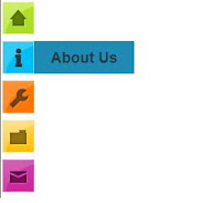
<div style='position: fixed; top: 40%; left: 0%;'/>
<ul id="navigationMenu">
<li>
<a class="Home" href="http://uandme2share.blogspot.in">
<span>Home</span>
</a>
</li>
<li>
<a class="about" href="http://uandme2share.blogspot.in">
<span>About Us</span>
</a>
</li>
<li>
<a class="categories" href="http://uandme2share.blogspot.in">
<span>Categories</span>
</a>
</li>
<li>
<a class="services" href="http://uandme2share.blogspot.in">
<span>Disclaimer</span>
</a>
</li>
<li>
<a class="contact" href="http://uandme2share.blogspot.in">
<span>Contact</span>
</a>
</li>
</ul>
</div>
Replace http://uandme2share.blogspot.in with your Links
7. Now save your HTML/Javascript'.
You are done...
Cool Css Button With Hover Style For Blogger
This is Cool Css button. It include with cool hover style.you can add this button any where in your blog with this code.Follow these steps to add it to your blog.

1. Log in to blogger account and Go to Design >> Edit HTML
2. Find this tag by using Ctrl+F ]]></b:skin>
3. Paste below code Before ]]></b:skin> tag
Now you can save your Template.
When you want to add it to your blog. Use Like below
When you want to add button use above link and.
* Replace
*Replace
You have done , Cheers
1. Log in to blogger account and Go to Design >> Edit HTML
2. Find this tag by using Ctrl+F ]]></b:skin>
3. Paste below code Before ]]></b:skin> tag
.hb-buttons{
background-color:#4b3f39;
font-family: 'Verdana', sans-serif;
font-size:12px;
text-decoration:none;
color:#fff;
position:relative;
padding:10px 20px;
padding-right:50px;
background-image: linear-gradient(bottom, rgb(62,51,46) 0%, rgb(101,86,78) 100%);
border-radius: 5px;
box-shadow: inset 0px 1px 0px #9e8d84, 0px 5px 0px 0px #322620, 0px 10px 5px #999;
}

.hb-buttons:active {
top:3px;
background-image: linear-gradient(bottom, rgb(62,51,46) 100%, rgb(101,86,78) 0%);
box-shadow: inset 0px 1px 0px #9e8d84, 0px 2px 0px 0px #322620, 0px 5px 3px #999;
}

.hb-buttons:before {
background-color:#322620;
background-image:url(https://blogger.googleusercontent.com/img/b/R29vZ2xl/AVvXsEgOZPhdnJk2PM3nkOW6zRIl7awAmhosMQe5ANIwuHc-nxLEYf1ZhQj94IH53xBkOqpsX01glNLFOGAKRT6SLs8_k0Z9vnjMPaQRqzmCcxico9MVF5K0x0aoO7fQemcifNXShORivXSk8-8/h80/helper-blogger-right-arrow.png);
background-repeat:no-repeat;
background-position:center center;
content:"";
width:20px;
height:20px;
position:absolute;
right:15px;
top:50%;
margin-top:-9px;
border-radius: 50%;
box-shadow: inset 0px 1px 0px #19120f, 0px 1px 0px #827066;
}

.hb-buttons:active::before {
top:50%;
margin-top:-12px;
box-shadow: inset 0px 1px 0px #827066, 0px 3px 0px #19120f, 0px 6px 3px #382e29;
}
Now you can save your Template.
When you want to add it to your blog. Use Like below
<a href="YOUR LINK " class="hb-buttons">Button name</a>When you want to add button use above link and.
* Replace
YOUR LINK With your URL*Replace
Button name With any name you want.You have done , Cheers
Subscribe to:
Posts (Atom)