
Sunday, August 12, 2012
Css Blend Style Menu Bar For Blogger
This is also nice hover style menubar, Its color
like blend style. This menubar not include
drop down feature,But this will more attractive
for dark color blogger templates.Earlier also i
posted about css menubar its also similar to this.
Attractive Css Drop Down Menu Bar For Blogger

Demo
1. Log in to blogger account and Go to Design >> Edit HTML
(make sure backup your template first)
2. Put checked marked in Expand Widget Templates
3. Find this tag by using Ctrl+F </head>
4. Paste below code Before </head> tag
5. Now Find this code by using Ctrl+F <div id='content-wrapper'>
6. Paste below code Before <div id='content-wrapper'> code
*Replace # With your URL
*Replace Name with as your like.
7. Now save your template
you are done.
1. Log in to blogger account and Go to Design >> Edit HTML
(make sure backup your template first)
2. Put checked marked in Expand Widget Templates
3. Find this tag by using Ctrl+F </head>
4. Paste below code Before </head> tag
<style>
*{padding:0; border:0; margin:0;}
#default a,
#example a{
display:block;
width:90px;
height:46px;
margin-right:3px;
float:left;
background-image:url(https://blogger.googleusercontent.com/img/b/R29vZ2xl/AVvXsEjRE-cpBoK8_3nvZ2zvWHG5PX0b7mXC_T4vRnU1QzJAQLloV3I243UOJ_Lx0NCpbMJJ6qNwDfZST3AsRZyZhifQU2TcmJQvNhjskDuAki9Uau1Em9jFZ0IJtMIs7Hw7pYQ-3t48yPLIbcY/s1600/nav-sprite.png);
background-repeat:no-repeat;
cursor:pointer;
text-indent:-9999px;}
#example_home{background-position:0 0;}
#example_home:hover,#example_home.hover{background-position:0 -48px;}
#example_blog{background-position:-90px 0;}
#example_blog:hover,#example_blog.hover{background-position:-90px -48px;}
#example_demo{background-position:-180px 0;}
#example_demo:hover,#example_demo.hover{background-position:-180px -48px;}
#example_about{background-position:-270px 0;}
#example_about:hover,#example_about.hover{background-position:-270px -48px;}
#example_services{background-position:-360px 0;}
#example_services:hover,#example_services.hover{background-position:-360px -48px;}
#example_contact{background-position:-450px 0;}
#example_contact:hover,#example_contact.hover{background-position:-450px -48px;}
</style>
<script src='http://ajax.googleapis.com/ajax/libs/jquery/1.7.0/jquery.min.js'/>
<script src='jquery.blend.js'/>
<script>
$(document).ready(function(){
$("#example a").blend();
$("#example2 a").blend();
});
</script>
5. Now Find this code by using Ctrl+F <div id='content-wrapper'>
6. Paste below code Before <div id='content-wrapper'> code
<div id='demo'>
<div id="example">
<a href="#" id="example_home">Home</a>
<a href="#" id="example_blog">Blog</a>
<a href="#" id="example_demo">Demo</a>
<a href="#" id="example_about">About</a>
<a href="#" id="example_services">Services</a>
<a href="http://www.bloggertrix.com/" id="example_contact">Add This</a>
</div></div>
*Replace # With your URL
*Replace Name with as your like.
7. Now save your template
you are done.
Blogger Labels / Category With Cool Css3 Style
This is also cool trick for change your
blogger labels, category with nice style.
you can see below image. Its looks so
great,Earlier i posted about same trick
Change Blogger Label Links As Brick/ Box Style. Follow below steps to add it
to your blog.

1. Log in to blogger account & Go to Design >> Edit HTML
2. Find this code by using Ctrl+F ]]></b:skin>
3.Paste below code Before ]]></b:skin> code
4. Now Click Save Template.
You are done...
1. Log in to blogger account & Go to Design >> Edit HTML
2. Find this code by using Ctrl+F ]]></b:skin>
3.Paste below code Before ]]></b:skin> code
.label-size {
    float: left;
    margin: 0 0 7px 20px;
    position: relative;
    font-family: 'Helvetica Neue', Helvetica, Arial, sans-serif;
    font-size: 0.75em;
    font-weight: bold;
    text-decoration: none;
    color: #996633;
    text-shadow: 0px 1px 0px rgba(255,255,255,.4);
    padding: 0.417em 0.417em 0.417em 0.917em;
    border-top: 1px solid #d99d38;
    border-right: 1px solid #d99d38;
    border-bottom: 1px solid #d99d38;
    -webkit-border-radius: 0 0.25em 0.25em 0;
    -moz-border-radius: 0 0.25em 0.25em 0;
    border-radius: 0 0.25em 0.25em 0;
    background-image: -webkit-linear-gradient(top, rgb(254, 218, 113), rgb(254, 186, 71));
    background-image: -moz-linear-gradient(top, rgb(254, 218, 113), rgb(254, 186, 71));
    background-image: -o-linear-gradient(top, rgb(254, 218, 113), rgb(254, 186, 71));
    background-image: -ms-linear-gradient(top, rgb(254, 218, 113), rgb(254, 186, 71));
    background-image: linear-gradient(top, rgb(254, 218, 113), rgb(254, 186, 71));
    filter: progid:DXImageTransform.Microsoft.gradient(GradientType=0,StartColorStr='#feda71', EndColorStr='#feba47');
    -webkit-box-shadow: inset 0 1px 0 #faeaba,
        0 1px 1px rgba(0,0,0,.1);
    -moz-box-shadow: inset 0 1px 0 #faeaba,
        0 1px 1px rgba(0,0,0,.1);
    box-shadow: inset 0 1px 0 #faeaba,
        0 1px 1px rgba(0,0,0,.1);
    z-index: 1;
}

.label-size:before {
    content: '';
    width: 1.30em;
    height: 1.39em;
    background-image: -webkit-linear-gradient(left top, rgb(254, 218, 113), rgb(254, 186, 71));
    background-image: -moz-linear-gradient(left top, rgb(254, 218, 113), rgb(254, 186, 71));
    background-image: -o-linear-gradient(left top, rgb(254, 218, 113), rgb(254, 186, 71));
    background-image: -ms-linear-gradient(left top, rgb(254, 218, 113), rgb(254, 186, 71));
    background-image: linear-gradient(left top, rgb(254, 218, 113), rgb(254, 186, 71));
    filter: progid:DXImageTransform.Microsoft.gradient(GradientType=1,StartColorStr='#feda71', EndColorStr='#feba47');
    position: absolute;
    left: -0.69em;
    top: .2em;
    -webkit-transform: rotate(45deg);
    -moz-transform: rotate(45deg);
    -o-transform: rotate(45deg);
    transform: rotate(45deg);
    border-left: 1px solid #d99d38;
    border-bottom: 1px solid #d99d38;
    -webkit-border-radius: 0 0 0 0.25em;
    -moz-border-radius: 0 0 0 0.25em;
    border-radius: 0 0 0 0.25em;
    z-index: 1;
}

.label-size:after {
    content: '';
    width: 0.5em;
    height: 0.5em;
    background: #fff;
    -webkit-border-radius: 4.167em;
    -moz-border-radius: 4.167em;
    border-radius: 4.167em;
    border: 1px solid #d99d38;
    -webkit-box-shadow: 0 1px 0 #faeaba;
    -moz-box-shadow: 0 1px 0 #faeaba;
    box-shadow: 0 1px 0 #faeaba;
    position: absolute;
    top: 0.667em;
    left: -0.083em;
    z-index: 9999;
}

#Label1 {
    height: 210px;
}

.label-size:hover {
    background-image: -webkit-linear-gradient(top, rgb(254, 225, 141), rgb(254, 200, 108));
    background-image: -moz-linear-gradient(top, rgb(254, 225, 141), rgb(254, 200, 108));
    background-image: -o-linear-gradient(top, rgb(254, 225, 141), rgb(254, 200, 108));
    background-image: -ms-linear-gradient(top, rgb(254, 225, 141), rgb(254, 200, 108));
    background-image: linear-gradient(top, rgb(254, 225, 141), rgb(254, 200, 108));
    filter: progid:DXImageTransform.Microsoft.gradient(GradientType=0,StartColorStr='#fee18d', EndColorStr='#fec86c');
    border-color: #e1b160;
}

.label-size:hover:before {
    background-image: -webkit-linear-gradient(left top, rgb(254, 225, 141), rgb(254, 200, 108));
    background-image: -moz-linear-gradient(left top, rgb(254, 225, 141), rgb(254, 200, 108));
    background-image: -o-linear-gradient(left top, rgb(254, 225, 141), rgb(254, 200, 108));
    background-image: -ms-linear-gradient(left top, rgb(254, 225, 141), rgb(254, 200, 108));
    background-image: linear-gradient(left top, rgb(254, 225, 141), rgb(254, 200, 108));
    filter: progid:DXImageTransform.Microsoft.gradient(GradientType=1,StartColorStr='#fee18d', EndColorStr='#fec86c');
    border-color: #e1b160;
}
4. Now Click Save Template.
You are done...
Change Blogger Label Links As Brick / Box Style
In this tutorial im going to explain, how to add
brick or box style for label gadget in blogger.
Actually,this is a cool style for your blog.
Most of your visitors like it. And view your more
categories.You can apply it to your blog with
easy steps, you can try it.

1. Log in to blogger account & Go to Design >> Edit HTML
2. Find this code by using Ctrl+F ]]></b:skin>
3.Paste below code Before ]]></b:skin> code
You are done...
1. Log in to blogger account & Go to Design >> Edit HTML
2. Find this code by using Ctrl+F ]]></b:skin>
3.Paste below code Before ]]></b:skin> code
#Label1 a{
color:#333;
padding:2px 8px;
line-height:24px;
margin:0 2px;
background:#eee url(https://blogger.googleusercontent.com/img/b/R29vZ2xl/AVvXsEjn0e_KvffKHiZBmFsm2GmcpzJiTA0yT7fMlHpmW9R7cQN_iJtifpPV7Q9UjdmyiHNIGZfNcOolhhzGQhK3P_qpNp02_2sg44SC-5NbfkDuggBDtYud_GtBL37U0PArnKxE9PMdStogJtk/s1600/bricks.png) center center repeat-x;
border:1px solid #ddd;
-webkit-border-radius:6px;
-moz-border-radius:6px;
border-radius:6px;
font-size:10px !important;
text-decoration:none;}
#Label1 a:hover{
color:#666;
background:none #fff;
text-decoration:none;}
4. Now Click Save Template.You are done...
How to add floating social subscribe buttons for blogger
This is a cool unique subscribe gadget with nice buttons.
Add to your blog and make it attractive.
 1. Log in to blogger and Go to Design >> Page Element.
2. Click Add Gadget and select 'HTML/Javascript'
3.Paste below code.
* Repalce facebook profile url with your URL
* Repalce your twitter username with your URL
* Replace YOURFEEDNAME with your feed name
* Replace yourfeedname with your feed name
4. Now save your HTML/Javascript'.
you are done.
2. Click Add Gadget and select 'HTML/Javascript'
3.Paste below code.
<div style='position: fixed; bottom: 1%; right: 1%;'>
<table border="0"><tr><td>
<a href='facebook profile url' target="_blank"><img alt="Find Us On Facebook" border="0"style='background:transparent;border:none;' title='like us on facebook' src="https://blogger.googleusercontent.com/img/b/R29vZ2xl/AVvXsEgwOcVkLy8SSNvj-fX46vJ9hB_YjYeIXCYrB_-3rvJVMTYXFK5_Fu4yFsqjiHaeX92pY7sN6J39n2mdKq5D_YpJ-1CdWx6BqM5OqgjE1rjZz4rlKY_7iV1xEFjEgUCPs7o-EPHyOxcwe-w/s1600/facebook-icon.png" /></a>
<a href='http://twitter.com/your twitter username' target="_blank"><img alt="Follow Us On Twitter" border="0"style='background:transparent;border:none;' title='follow us on twitter' src="https://blogger.googleusercontent.com/img/b/R29vZ2xl/AVvXsEjiG0swDN-j66lGaZfHaCMAJxeA6xOWnQh4gTMIbNH3-DEHW7Z8qj-xKX7BdNtRNGH4DeFbqxOlPcOLNLa9aAGPVDgxdtckoyJ_KMQwO16p4yAWrbt1DmEXptcH7hjkBVYXuupUJ-5_gVc/s1600/twitter-icon.png" /></a>
<a href="http://feeds.feedburner.com/YOURFEEDNAME" target="_blank"><img alt="Rss Feed Options" border="0"style='background:transparent;border:none;' title='subscribe us' src="https://blogger.googleusercontent.com/img/b/R29vZ2xl/AVvXsEi-NR6-pKCG-ulXyZoy-6VzM2OgmI2rSa3eiwtCbENRK-bteyavlimodg1HCNyMkgOz3yRkiaK3E1YfwCJ7EUMkr1yKHCK8pJCZcQn2dRzG55URaqxhLHG3wOfMi27sO6dBLx-xr8Eh90w/s1600/rss-icon.png" /></a>
<a href='http://feedburner.google.com/fb/a/mailverify?uri=yourfeedname&loc=en_us' target="_blank"><img alt="Subscribe Via Email Rss" border="0" style='background:transparent;border:none;' title=' email subscribe'src="https://blogger.googleusercontent.com/img/b/R29vZ2xl/AVvXsEhMdoisNmRI-TuzuRHN_WaJZslVr__O_QRn6Siq2Dpx42Nbi3dCBzUvQuYBleEQazHAlppzbDpTmOdxifIxbHQr7cewEh1AaeE4vDEf09shXrqJ_TB6yB0YuuS6VrtEI7iCE5kEp7XtrrQ/s1600/rss-mail.png" /></a>
</td><td>
</td></tr></table>
<div style="clear: both;font-size: 8px;text-align:center;margin-top:-10px;"><a href="http://ehowportal.blogspot.com/2011/05/how-to-add-floating-social-media.html"><p>Get this</p></a></div>

</div>
* Repalce facebook profile url with your URL
* Repalce your twitter username with your URL
* Replace YOURFEEDNAME with your feed name
* Replace yourfeedname with your feed name
4. Now save your HTML/Javascript'.
you are done.
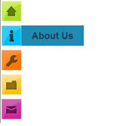
Add Cool Css Sprites Menu For Blogger
This is cool sprite menu style. It work with Firefox 3.5, IE 7, Chrome 3.0 & Opera 9.02 Its look very attractive.I include 4 style menu.You can make attractive your blog. Its easy to add it to your blog.Follow below simple steps. Earlier i created more horizontal menubars, click below links to view all. most of are includewith demo.
Menubar Collection
 1. Log in to blogger account and Go to Design >> Edit HTML
2. Put checked marked in Expand Widget Templates
3. Find this code by using Ctrl+F <div id='content-wrapper'>
4. Paste below code Before <div id='content-wrapper'> code
*Replace # With your URL
5. Find this tag by using Ctrl+F ]]></b:skin>
6. Paste below one of code Before ]]></b:skin> tag (choose a style as your like.)
Style 1
Style 2
Menubar Collection
2. Put checked marked in Expand Widget Templates
3. Find this code by using Ctrl+F <div id='content-wrapper'>
4. Paste below code Before <div id='content-wrapper'> code
<div class="bloggertrix-navi1">
  <ul>
    <li class="sm1"><a href="#"></a></li>
    <li class="sm2"><a href="#"></a></li>
    <li class="sm3"><a href="#"></a></li>
    <li class="sm4"><a href="#"></a></li>
    <li class="sm5"><a href="http://www.bloggertrix.com/"></a></li>
  </ul>
</div>
*Replace # With your URL
5. Find this tag by using Ctrl+F ]]></b:skin>
6. Paste below one of code Before ]]></b:skin> tag (choose a style as your like.)
Style 1
/*menubar by bloggertrix.com */
.bloggertrix-navi1 {
    display:block;
    height:72px;
    margin:30px auto;
    position:relative;
    width:525px; }
.bloggertrix-navi1 ul {
    float:none;
    list-style-image:none;
    list-style-type:none;
    margin:3px 0; }
.bloggertrix-navi1 ul li {
    background-image:url(https://blogger.googleusercontent.com/img/b/R29vZ2xl/AVvXsEhXbBWw7rf_8jZS05fHVHa-G0lB9xNHghytDZqpRTrj0kqt8UPUW0k3qgMAM6LxwHOgJ_g8x1Mwcvw59wEj776kfDY6PcUwJ969Aq6hzTCe7hgKcdR8lqyWefoU-1Qy0zuyNNR8C_KfQa4/s1600/bloggertrix.com-tab-1.png);
    background-repeat:no-repeat;
    float:left;
    height:72px;
    margin:0px;
    padding-top:5px;
    position:absolute; }
.bloggertrix-navi1 ul li a {
    display:block;
    height:100%;
    width:100%; }
.bloggertrix-navi1 ul li.sm1 {
    background-position:0 0;
    left:0px;
    width:125px; }
.bloggertrix-navi1 ul li.sm2 {
    background-position:-125px 0;
    left:100px;
    width:124px; }
.bloggertrix-navi1 ul li.sm3 {
    background-position:-249px 0;
    left:200px;
    width:124px; }
.bloggertrix-navi1 ul li.sm4 {
    background-position:-373px 0;
    left:300px;
    width:125px; }
.bloggertrix-navi1 ul li.sm5 {
    background-position:-498px 0;
    left:400px;
    width:126px; }
.bloggertrix-navi1 ul li:hover {
    z-index:1000; }
.bloggertrix-navi1 ul li.sm1:hover {
    background-position:0 -75px; }
.bloggertrix-navi1 ul li.sm2:hover {
    background-position:-125px -75px; }
.bloggertrix-navi1 ul li.sm3:hover {
    background-position:-249px -75px; }
.bloggertrix-navi1 ul li.sm4:hover {
    background-position:-373px -75px; }
.bloggertrix-navi1 ul li.sm5:hover {
    background-position:-498px -75px; }
/*menubar by bloggertrix.com */
Style 2
/*menubar by bloggertrix.com */
bloggertrix-navi2 {
    display:block;
    height:72px;
    margin:30px auto;
    position:relative;
    width:525px; }
bloggertrix-navi2 ul {
    float:none;
    list-style-image:none;
    list-style-type:none;
    margin:3px 0; }
bloggertrix-navi2 ul li {
    background-image:url(https://blogger.googleusercontent.com/img/b/R29vZ2xl/AVvXsEhNUwNmcqKgUtDJrRH1CUygk_-dvVqcpvzcIjmIMAKtFdsv5UU4vaRQtFd5rrBSlUMs3js7VnZK9MRTqlVjY4mQJM19SvfgY27FOCvosAOJIqVZ2TaYLr9XIPt3dZm78QeYqvFNNgiibm4/s1600/bloggertrix.com-tab-2.png);
    background-repeat:no-repeat;
    float:left;
    height:72px;
    margin:0px;
    padding-top:5px;
    position:absolute; }
bloggertrix-navi2 ul li a {
    display:block;
    height:100%;
    width:100%; }
bloggertrix-navi2 ul li.sm1 {
    background-position:0 0;
    left:0px;
    width:125px; }
bloggertrix-navi2 ul li.sm2 {
    background-position:-125px 0;
    left:100px;
    width:124px; }
bloggertrix-navi2 ul li.sm3 {
    background-position:-249px 0;
    left:200px;
    width:124px; }
bloggertrix-navi2 ul li.sm4 {
    background-position:-373px 0;
    left:300px;
    width:125px; }
bloggertrix-navi2 ul li.sm5 {
    background-position:-498px 0;
    left:400px;
    width:126px; }
bloggertrix-navi2 ul li:hover {
    z-index:1000; }
bloggertrix-navi2 ul li.sm1:hover {
    background-position:0 -75px; }
bloggertrix-navi2 ul li.sm2:hover {
    background-position:-125px -75px; }
bloggertrix-navi2 ul li.sm3:hover {
    background-position:-249px -75px; }
bloggertrix-navi2 ul li.sm4:hover {
    background-position:-373px -75px; }
bloggertrix-navi2 ul li.sm5:hover {
    background-position:-498px -75px; }
/*menubar by bloggertrix.com */
7. Now save your template you are done. Attractive Css3 Drop Down Menubar For Blogger
Some css menubars are great looking,This is
also nice looking menubar with drop-down
style.You can link with main Categories,
pages, and important posts,with menu bar.
Earlier also i posted about css menubar its also similar to this. Attractive Css Drop DownMenu Bar For Blogger

Demo
1. Log in to blogger account and Go to Design >> Edit HTML
(make sure backup your template first)
2. Put checked marked in Expand Widget Templates
3. Find this tag by using Ctrl+F ]]></b:skin>
4. Paste below code Before ]]></b:skin> tag
5. Now Find this code by using Ctrl+F <div id='content-wrapper'>
6. Paste below code Before <div id='content-wrapper'> code
*Replace # With your URL
*Replace Name with as your like.
7. Now save your template
you are done.
1. Log in to blogger account and Go to Design >> Edit HTML
(make sure backup your template first)
2. Put checked marked in Expand Widget Templates
3. Find this tag by using Ctrl+F ]]></b:skin>
4. Paste below code Before ]]></b:skin> tag
#nav {   float: left;
        font: bold 12px Arial, Helvetica, Sans-serif;
        border: 1px solid #121314;
        border-top: 1px solid #2b2e30;
        -webkit-border-radius: 5px;
        -moz-border-radius: 5px;
        border-radius: 5px;
        overflow: hidden;}
#nav ul {
        margin:0;
        padding:0;
        list-style:none;}
#nav ul li {
        float:left;}
#nav ul li a {
        float: left;
        color:#d4d4d4;
        padding: 10px 20px;
        text-decoration:none;
        background:#3C4042;
        background: -webkit-gradient( linear, left bottom, left top, color-stop(0.09, rgb(59,63,65)), color-stop(0.55, rgb(72,76,77)), color-stop(0.78, rgb(75,77,77)) );
        background: -moz-linear-gradient( center bottom, rgb(59,63,65) 9%, rgb(72,76,77) 55%, rgb(75,77,77) 78% );
        background: -o-linear-gradient( center bottom, rgb(59,63,65) 9%, rgb(72,76,77) 55%, rgb(75,77,77) 78% );
        box-shadow: 0 1px 0 rgba(255, 255, 255, 0.1) inset, 0 0 5px rgba(0, 0, 0, 0.1) inset;
        border-left: 1px solid rgba(255, 255, 255, 0.05);
        border-right: 1px solid rgba(0,0,0,0.2);
        text-shadow: 0 -1px 1px rgba(0, 0, 0, 0.6);}
#nav li ul {
        background:#3C4042;
        background-image: -webkit-gradient( linear, left bottom, left top, color-stop(0.09, rgb(77,79,79)), color-stop(0.55, rgb(67,70,71)), color-stop(0.78, rgb(69,70,71)) );
        background-image: -moz-linear-gradient( center bottom, rgb(77,79,79) 9%, rgb(67,70,71) 55%, rgb(69,70,71) 78% );
        background-image: -o-linear-gradient( center bottom, rgb(77,79,79) 9%, rgb(67,70,71) 55%, rgb(69,70,71) 78% );
        border-radius: 0 0 10px 10px;
        -moz-border-radius: 0 0 10px 10px;
        -webkit-border-radius: 0 0 10px 10px;
        left: -999em;
        margin: 35px 0 0;
        position: absolute;
        width: 160px;
        z-index: 9999;
        box-shadow: 0 0 15px rgba(0, 0, 0, 0.4) inset;
        -moz-box-shadow: 0 0 15px rgba(0, 0, 0, 0.4) inset;
        -webkit-box-shadow: 0 0 15px rgba(0, 0, 0, 0.4) inset;
        border: 1px solid rgba(0, 0, 0, 0.5);
}

#nav li ul a {
        background: none;
        border: 0 none;
        margin-right: 0;
        width: 120px;
        box-shadow: none;
        -moz-box-shadow: none;
        -webkit-box-shadow: none;
        border-bottom: 1px solid transparent;
        border-top: 1px solid transparent;
}
#nav ul li a:hover,
#nav ul li:hover > a {
        color: #252525;
        background:#3C4042;
        background: -webkit-gradient( linear, left bottom, left top, color-stop(0.09, rgb(77,79,79)), color-stop(0.55, rgb(67,70,71)), color-stop(0.78, rgb(69,70,71)) );
        background: -moz-linear-gradient( center bottom, rgb(77,79,79) 9%, rgb(67,70,71) 55%, rgb(69,70,71) 78% );
        background: -o-linear-gradient( center bottom, rgb(77,79,79) 9%, rgb(67,70,71) 55%, rgb(69,70,71) 78% );
        text-shadow: 0 1px 0 rgba(255, 255, 255, 0.2), 0 -1px #000;

}

#nav li ul a:hover,
#nav ul li li:hover > a  {
    color: #2c2c2c;
        background: #5C9ACD;
        background: -webkit-gradient( linear, left bottom, left top, color-stop(0.17, rgb(61,111,177)), color-stop(0.51, rgb(80,136,199)), color-stop(1, rgb(92,154,205)) );
        background: -moz-linear-gradient( center bottom, rgb(61,111,177) 17%, rgb(80,136,199) 51%, rgb(92,154,205) 100% );
        background: -o-linear-gradient( center bottom, rgb(61,111,177) 17%, rgb(80,136,199) 51%, rgb(92,154,205) 100% );
        border-bottom: 1px solid rgba(0,0,0,0.6);
        border-top: 1px solid #7BAED9;
        text-shadow: 0 1px rgba(255, 255, 255, 0.3);
}

#nav li:hover ul {
        left: auto;
}

#nav li li ul {
        margin: -1px 0 0 160px;
        -webkit-border-radius: 0 10px 10px 10px;
        -moz-border-radius: 0 10px 10px 10px;
        border-radius: 0 10px 10px 10px;
        visibility:hidden;
}

#nav li li:hover ul {
        visibility:visible;
}
5. Now Find this code by using Ctrl+F <div id='content-wrapper'>
6. Paste below code Before <div id='content-wrapper'> code
<div id="nav">
<ul>
<li><a href="#">Home</a></li>
<li><a href="#">About Us</a></li>
<li><a href="#">Our Portfolio</a></li>
<li><a href="#">One Dropdown</a>
        <ul>
        <li><a href="#">Level 1</a></li>
        <li><a href="#">Level 2</a></li>
        <li><a href="#">Level 3</a></li>
        <li><a href="#">Level 4</a></li>
        <li><a href="#">Level 5</a></li>
        </ul>
</li>
<li><a href="#">Three Levels</a>
        <ul>
        <li><a href="#">Level 1</a></li>
        <li><a href="#">Level 2</a></li>
        <li><a href="#">Level 3</a>
                <ul>
                <li><a href="#">Level 1</a></li>
                <li><a href="#">Level 2</a></li>
                <li><a href="#">Level 3</a></li>
                <li><a href="#">Level 4</a></li>
                <li><a href="#">Level 5</a></li>
                <li><a href="#">Level 6</a></li>
                <li><a href="#">Level 7</a></li>
                </ul>
        </li>
        <li><a href="#">Level 4</a></li>
        <li><a href="#">Level 5</a></li>
        </ul>
</li>
<li><a href="#">Services</a></li>
<li><a href="http://www.bloggertrix.com/">Add This</a></li>
</ul>
</div>
*Replace # With your URL
*Replace Name with as your like.
7. Now save your template
you are done.
Attractive Css Drop Down Menu Bar For Blogger
This is a another cool menu bar to your blog.
Drop down menu is the main thing that helps
to increase the attractive of your blog.You can
link with main Categories, pages, and important
posts ,with menu bar.
Hence, its easy to navigate
visitors thought this menu bar.This is great design
with Css. you ca do with easy steps. Follow these
steps to add it your blog.1. Log in to blogger account and Go to Design >> Edit HTML
(make sure backup your template first)
2. Put checked marked in Expand Widget Templates
3. Find this tag by using Ctrl+F ]]></b:skin>
4. Paste below code Before ]]></b:skin> tag

#hb-menu, #hb-menu ul {
margin: 0;
padding: 0;
list-style: none;
}
#hb-menu {
width: 960px;
margin: 60px auto;
border: 1px solid #222;
background-color: #111;
background-image: -moz-linear-gradient(#444, #111);
background-image: -webkit-gradient(linear, left top, left bottom, from(#444), to(#111));
background-image: -webkit-linear-gradient(#444, #111);
background-image: -o-linear-gradient(#444, #111);
background-image: -ms-linear-gradient(#444, #111);
background-image: linear-gradient(#444, #111);
-moz-border-radius: 6px;
-webkit-border-radius: 6px;
border-radius: 6px;
-moz-box-shadow: 0 1px 1px #777;
-webkit-box-shadow: 0 1px 1px #777;
box-shadow: 0 1px 1px #777;
}
#hb-menu:before,
#hb-menu:after {
content: "";
display: table;
}
#hb-menu:after {
clear: both;
}
#hb-menu {
zoom:1;
}
#hb-menu li {
float: left;
border-right: 1px solid #222;
-moz-box-shadow: 1px 0 0 #444;
-webkit-box-shadow: 1px 0 0 #444;
box-shadow: 1px 0 0 #444;
position: relative;
}
#hb-menu a {
float: left;
padding: 12px 30px;
color: #999;
text-transform: uppercase;
font: bold 12px Arial, Helvetica;
text-decoration: none;
text-shadow: 0 1px 0 #000;
}
#hb-menu li:hover > a {
color: #fafafa;
}
*html #hb-menu li a:hover { /* IE6 only */
color: #fafafa;
}
#hb-menu ul {
margin: 20px 0 0 0;
_margin: 0; /*IE6 only*/
opacity: 0;
visibility: hidden;
position: absolute;
top: 38px;
left: 0;
z-index: 9999;
background: #444;
background: -moz-linear-gradient(#444, #111);
background: -webkit-gradient(linear,left bottom,left top,color-stop(0, #111),color-stop(1, #444));
background: -webkit-linear-gradient(#444, #111);
background: -o-linear-gradient(#444, #111);
background: -ms-linear-gradient(#444, #111);
background: linear-gradient(#444, #111);
-moz-box-shadow: 0 -1px rgba(255,255,255,.3);
-webkit-box-shadow: 0 -1px 0 rgba(255,255,255,.3);
box-shadow: 0 -1px 0 rgba(255,255,255,.3);
-moz-border-radius: 3px;
-webkit-border-radius: 3px;
border-radius: 3px;
-webkit-transition: all .2s ease-in-out;
-moz-transition: all .2s ease-in-out;
-ms-transition: all .2s ease-in-out;
-o-transition: all .2s ease-in-out;
transition: all .2s ease-in-out;
}
#hb-menu li:hover > ul {
opacity: 1;
visibility: visible;
margin: 0;
}
#hb-menu ul ul {
top: 0;
left: 150px;
margin: 0 0 0 20px;
_margin: 0; /*IE6 only*/
-moz-box-shadow: -1px 0 0 rgba(255,255,255,.3);
-webkit-box-shadow: -1px 0 0 rgba(255,255,255,.3);
box-shadow: -1px 0 0 rgba(255,255,255,.3);
}
#hb-menu ul li {
float: none;
display: block;
border: 0;
_line-height: 0; /*IE6 only*/
-moz-box-shadow: 0 1px 0 #111, 0 2px 0 #666;
-webkit-box-shadow: 0 1px 0 #111, 0 2px 0 #666;
box-shadow: 0 1px 0 #111, 0 2px 0 #666;
}
#hb-menu ul li:last-child {
-moz-box-shadow: none;
-webkit-box-shadow: none;
box-shadow: none;
}
#hb-menu ul a {
padding: 10px;
width: 130px;
_height: 10px; /*IE6 only*/
display: block;
white-space: nowrap;
float: none;
text-transform: none;
}
#hb-menu ul a:hover {
background-color: #0186ba;
background-image: -moz-linear-gradient(#04acec, #0186ba);
background-image: -webkit-gradient(linear, left top, left bottom, from(#04acec), to(#0186ba));
background-image: -webkit-linear-gradient(#04acec, #0186ba);
background-image: -o-linear-gradient(#04acec, #0186ba);
background-image: -ms-linear-gradient(#04acec, #0186ba);
background-image: linear-gradient(#04acec, #0186ba);
}
#hb-menu ul li:first-child > a {
-moz-border-radius: 3px 3px 0 0;
-webkit-border-radius: 3px 3px 0 0;
border-radius: 3px 3px 0 0;
}
#hb-menu ul li:first-child > a:after {
content: '';
position: absolute;
left: 40px;
top: -6px;
border-left: 6px solid transparent;
border-right: 6px solid transparent;
border-bottom: 6px solid #444;
}
#hb-menu ul ul li:first-child a:after {
left: -6px;
top: 50%;
margin-top: -6px;
border-left: 0;
border-bottom: 6px solid transparent;
border-top: 6px solid transparent;
border-right: 6px solid #3b3b3b;
}
#hb-menu ul li:first-child a:hover:after {
border-bottom-color: #04acec;
}
#hb-menu ul ul li:first-child a:hover:after {
border-right-color: #0299d3;
border-bottom-color: transparent;
}
#hb-menu ul li:last-child > a {
-moz-border-radius: 0 0 3px 3px;
-webkit-border-radius: 0 0 3px 3px;
border-radius: 0 0 3px 3px;
}
5. Now Find this code by using Ctrl+F <div id='content-wrapper'>
6. Paste below code Before <div id='content-wrapper'> code
<ul id="hb-menu">
<li><a href="#">Home</a></li>
<li>
<a href="#">Categories</a>
<ul>
<li><a href="#">CSS</a></li>
<li><a href="#">Graphic design</a><ul>
<li><a href="#">Link 1</a></li>
<li><a href="#">Link 2</a></li>
<li><a href="#">Link 3</a></li>
<li><a href="#">Link 4</a></li>
</ul>   </li>
<li><a href="#">Development tools</a></li>
<li><a href="#">Web design</a></li>
</ul>
</li>
<li><a href="#">Work</a></li>
<li><a href="#">About</a>
<ul>
<li><a href="#">CSS</a>
<ul>
<li><a href="#">Link 5</a></li>
<li><a href="#">Link 6</a></li>
<li><a href="#">Link 7</a></li>
<li><a href="#">Link 8</a></li>
</ul>

</li>
<li><a href="#">Graphic design</a></li>
<li><a href="#">Development tools</a></li>
<li><a href="#">Web design</a></li>
</ul>

</li>
<li><a href="#">Contact</a></li>
<li><a href="http://www.bloggertrix.com/">Add This  »</a></li></ul>
*Replace # With your URL
*Replace Name with as your like.
7. Now save your template
you are done.
Cool Leaves Social Bookmark Buttons For Blogger
This post helps you to,How to add leaves social bookmark
button for below your blogger post
 1. Log in to blogger account and Go to Design >> Edit HTML
2. Make sure you put check mark to “Expand Widget Templates”
3. Find this tag by using Ctrl+F ]]></b:skin>
4. Paste below code Before ]]></b:skin> tag
5. Now Find this tag also by using Ctrl+F
<div class='post-footer-line post-footer-line-1'>
If cant find above tag try to find below tag
6. After found one of above code, paste below code after it
7. You are done. Cheers
2. Make sure you put check mark to “Expand Widget Templates”
3. Find this tag by using Ctrl+F ]]></b:skin>
4. Paste below code Before ]]></b:skin> tag
.social {
padding: 5px 5px 5px 5px;
margin: 5px;
text-align:left;
font-family:Trebuchet MS;
font-size:12px;
height: 78px;
}
.social img {
margin:10px 2px 0px 2px;
padding: 3px 2px 2px 2px;
text-align:center;
border:1px solid #cfdde9;
}
.social img:hover {
border:1px solid #abcce9;
}
a.opacity img {
filter:alpha(opacity=100);
-moz-opacity: 1.0;
opacity: 1.0;
-khtml-opacity: 1.0;}
a.opacity:hover img {
filter:alpha(opacity=50);
-moz-opacity: 0.7;
opacity: 0.7;
-khtml-opacity: 0.7; }
5. Now Find this tag also by using Ctrl+F
<div class='post-footer-line post-footer-line-1'>
If cant find above tag try to find below tag
<p class='post-footer-line post-footer-line-1'>
6. After found one of above code, paste below code after it
<div class='social'> <strong> Share this </strong><a class='opacity' href='http://www.facebook.com/sharer.php?u=" + data:post.url + "&t=" + data:post.title' rel='external nofollow' target='_blank'><img alt='Facebook' src='https://blogger.googleusercontent.com/img/b/R29vZ2xl/AVvXsEgvIDmryYbJAocQG9ZM-XPEnjWkuUxw2km9VCkBEKDflS_PdLeDsJgVUqr7gVB01MGqSrOWOVrccUdn9OYJp2uPr07NGfo7DDOgCRFx6J8qohL_Ue4gyoeZU3BXxiw6M6j3Oud3VHpuQnc/s1600/Facebook.png' style='width:52px; height:52px; padding:0; border:0; vertical-align:middle;'/></a><a class='opacity' href='http://twitthis.com/twit?url=" + data:post.url' rel='external nofollow' target='_blank'><img alt='Twitter' src='https://blogger.googleusercontent.com/img/b/R29vZ2xl/AVvXsEgBDilL8IoXMss32uSbhbZRz1m6hreqoKDjiJTl-TFDevMOl_-imIlDdRqSh_Y1znadQurubVW2RVBsYYNMVF3sQ0k8VbICytTqPnucACJGxhAk58v8Tg8R_RfbNKntNl4LN49nHIqXbXE/s1600/Twitter.png' style='width:52px; height:52px; padding:0; border:0; vertical-align:middle;'/></a> <a class='opacity' href='http://del.icio.us/post?url=" + data:post.url + "&title=" + data:post.title' rel='external nofollow' target='_blank'><img alt='Delicious' src='https://blogger.googleusercontent.com/img/b/R29vZ2xl/AVvXsEiInUicmBGtjEC6kmTD2jibxB5eAVz1uWu1uExjTgLcGVNzahHuhiVrjtfCPgeL8_soKKo61JntlwGytojO2FJqwDl579yVuydJSDaWrqWJ-UfK5Jj8ii3JH6isaGj6b_bwJ2rEayP10t4/s1600/del.icio.us.png' style='width:52px; height:52px; padding:0; border:0; vertical-align:middle;'/></a> <a class='opacity' href='http://www.stumbleupon.com/submit?url=" + data:post.url + "&title=" + data:post.title' rel='external nofollow' target='_blank'><img alt='StumbleUpon' src='https://blogger.googleusercontent.com/img/b/R29vZ2xl/AVvXsEiaz15re8-Q6580z7rt6tKmErnN7YufG_UPQa1ygOpdB8q01PDks0mwLXIRMHg-eGchcWAKwiYmRfqS6B_ZntIAfvVVNdJMQsNiwJIwb7UL8lMsfeFmsQuQ8fUKK5fAuvhPNJk1hpm50yk/s1600/StumbleUpon.png' style='width:52px; height:52px; padding:0; border:0; vertical-align:middle;'/></a> <a class='opacity' href='http://digg.com/submit?url=" + data:post.url + "&title=" + data:post.title' rel='external nofollow' target='_blank'><img alt='Digg' src='https://blogger.googleusercontent.com/img/b/R29vZ2xl/AVvXsEhk_X0KdWbVeZ1qCNcI0e4FBYshIBt-BQaJZw-6-MDDxWxiXlaOoQKDi37SeGCcSd6VuG0OR58bJqhMUobJ8yu-EGtLdwtYLVEQNW_IQp34rXIL11Lb_lRydCamUXNKPnAHAZcSMqc_xQw/s1600/Digg.png' style='width:52px; height:52px; padding:0; border:0; vertical-align:middle;'/></a> <a class='opacity' href='http://www.technorati.com/faves?add=" + data:post.url' rel='external nofollow' target='_blank'><img alt='Technorati' src='https://blogger.googleusercontent.com/img/b/R29vZ2xl/AVvXsEjZU8ZqVajaL3CG4W2MrUFp6Rp5E6y_7UQ8aSBm_4w9LTgKisc2VXbOSWyuwD7luLIGFUYgl2OyspRRYx5jmi9wEwC_W624muOjD2XRkivCtZZMCKoKS26KwkhuPyvc1sSstEYMgHEOZh8/s1600/Technorati.png' style='width:52px; height:52px; padding:0; border:0; vertical-align:middle;'/></a> <a class='opacity' href='data:blog.homepageUrl + "feeds/posts/default"' rel='external nofollow' target='_blank'><img alt='Feed' src='https://blogger.googleusercontent.com/img/b/R29vZ2xl/AVvXsEgvT8B4EEEVkzbIwac6T-IOTJ7fEBNxqSuhsHgFjmHERl-QAXIfzl1OwUo_WaJtM01g2KsrWcUQTXrfU1a9UZuoiZGaBQCp18UhKENO92zmwfXVupNXeyigp-QbkznVRZsI0Tmd5jRr5fk/s1600/RSS.png' style='width:52px; height:52px; padding:0; border:0; vertical-align:middle;'/></a> <a class='opacity' href='http://reddit.com/submit?&url=" + data:post.url + "&title=" + data:post.title' rel='nofollow' target='_blank'><img alt='Reddit' src='https://blogger.googleusercontent.com/img/b/R29vZ2xl/AVvXsEjiZB0_wAO04CFHohv9cugJKenQbowFicfxtqP5k8H2l-V8R_dqerX95Sx2w43kw7eOLLiAskeCllCmNxXKBeI3ZpOSvh1X0DpBjzie7JlWIjPv3-ZHHS10ZesMj55ZckgjSCQZVhXaKCE/s1600/Reddit.png' style='width:52px; height:52px; padding:0; border:0; vertical-align:middle;'/></a> </div>
7. You are done. Cheers
How To Add Blogger Vertical Stylish Css3 Side Menubar
How To Add Blogger Vertical Stylish Css3 Side Menubar . Its also include nice style with drop down.You can follow this easy steps to add it to your blog.
1. Log in to blogger Design > Edit HTML.
2. Find this tag by using Ctrl+F ]]></b:skin>
3. Paste below code Before ]]></b:skin> tag
4. Now Go to Design > Page Element.
5.Click Add Gadget and select 'HTML/Javascript
6. Paste below code.
Replace http://uandme2share.blogspot.in with your Links
7. Now save your HTML/Javascript'.
You are done...

1. Log in to blogger Design > Edit HTML.
2. Find this tag by using Ctrl+F ]]></b:skin>
3. Paste below code Before ]]></b:skin> tag
#hor {
list-style:none;
padding:0;
margin:0;}
#hor li {
float:left;
padding:5px;}
#hor a {
display:block;
height: 12px;
text-indent:-999em;}
#hor a.home {
width:46px;
background:url(vHome.gif) no-repeat 0 0;}
#hor a.download {
width:94px;
background:url(vDownload.gif) no-repeat 0 0;}
#hor a.contact {
width:74px;
background:url(vContact.gif) no-repeat 0 0;}
/* CSS Style for Vertical Menu */

#ver {
list-style:none;
padding:0;
margin:0;
}
#ver li {
padding:2px;}

#ver li a {
display:block;
height:12px;
text-indent:-999em;
}
#ver a.home {
width:47px;
background:url(hHome.gif) no-repeat 0 0;
}

#ver a.download {
width:95px;
background:url(hDownload.gif) no-repeat 0 0;
}

#ver a.contact {
width:74px;
background:url(hContact.gif) no-repeat 0 0;
}


.clear {
clear:both;
}


*{
/* A universal CSS reset */
margin:0;
padding:0;
}


#navigationMenu body{
font-size:14px;
color:#666;
background:#111 no-repeat;


/* CSS3 Radial Gradients */
background-image:-moz-radial-gradient(center -100px 45deg, circle farthest-corner, #444 150px, #111 300px);
background-image:-webkit-gradient(radial, 50% 0, 150, 50% 0, 300, from(#444), to(#111));

font-family:Arial, Helvetica, sans-serif;
}

#navigationMenu li{
list-style:none;
height:39px;
padding:2px;
width:40px;
}

#navigationMenu span{
/* Container properties */
width:0;
left:38px;
padding:0;
position:absolute;
overflow:hidden;

/* Text properties */
font-family:'Myriad Pro',Arial, Helvetica, sans-serif;
font-size:18px;
font-weight:bold;
letter-spacing:0.6px;
white-space:nowrap;
line-height:39px;

/* CSS3 Transition: */
-webkit-transition: 0.25s;

/* Future proofing (these do not work yet): */
-moz-transition: 0.25s;
transition: 0.25s;
}

#navigationMenu a{
background:url('https://blogger.googleusercontent.com/img/b/R29vZ2xl/AVvXsEjT55mG8gVtlwnMI6d8Fv02YNLr-zmJWOGxIkSBush09_-tEYtMt1z_CjlGc0HvN_4puFLxzWojSLbfRA4pfgBmeqlHFdfK6ThZC36SCI0Gm1pKwMbjRohrZEEB-XU9NSTK0tn8g8M_Vufj/s1600/navigation.jpg') no-repeat;

height:39px;
width:38px;
display:block;
position:relative;
}

/* General hover styles */

#navigationMenu a:hover span{ width:auto; padding:0 20px;overflow:visible; }
#navigationMenu a:hover{
text-decoration:none;

/* CSS outer glow with the box-shadow property */
-moz-box-shadow:0 0 5px #9ddff5;
-webkit-box-shadow:0 0 5px #9ddff5;
box-shadow:0 0 5px #9ddff5;
}

/* Green Button */

#navigationMenu .home { background-position:0 0;}
#navigationMenu .home:hover { background-position:0 -39px;}
#navigationMenu .home span{
background-color:#7da315;
color:#3d4f0c;
text-shadow:1px 1px 0 #99bf31;
}

/* Blue Button */

#navigationMenu .about { background-position:-38px 0;}
#navigationMenu .about:hover { background-position:-38px -39px;}
#navigationMenu .about span{
background-color:#1e8bb4;
color:#223a44;
text-shadow:1px 1px 0 #44a8d0;
}

/* Orange Button */

#navigationMenu .services { background-position:-76px 0;}
#navigationMenu .services:hover { background-position:-76px -39px;}
#navigationMenu .services span{
background-color:#c86c1f;
color:#5a3517;
text-shadow:1px 1px 0 #d28344;
}

/* Yellow Button */

#navigationMenu .portfolio { background-position:-114px 0;}
#navigationMenu .portfolio:hover{ background-position:-114px -39px;}
#navigationMenu .portfolio span{
background-color:#d0a525;
color:#604e18;
text-shadow:1px 1px 0 #d8b54b;
}

/* Purple Button */

#navigationMenu .contact { background-position:-152px 0;}
#navigationMenu .contact:hover { background-position:-152px -39px;}
#navigationMenu .contact span{
background-color:#af1e83;
color:#460f35;
text-shadow:1px 1px 0 #d244a6;
}
4. Now Go to Design > Page Element.
5.Click Add Gadget and select 'HTML/Javascript
6. Paste below code.
<div style='position: fixed; top: 40%; left: 0%;'/>
<ul id="navigationMenu">
<li>
<a class="Home" href="http://uandme2share.blogspot.in">
<span>Home</span>
</a>
</li>
<li>
<a class="about" href="http://uandme2share.blogspot.in">
<span>About Us</span>
</a>
</li>
<li>
<a class="categories" href="http://uandme2share.blogspot.in">
<span>Categories</span>
</a>
</li>
<li>
<a class="services" href="http://uandme2share.blogspot.in">
<span>Disclaimer</span>
</a>
</li>
<li>
<a class="contact" href="http://uandme2share.blogspot.in">
<span>Contact</span>
</a>
</li>
</ul>
</div>
Replace http://uandme2share.blogspot.in with your Links
7. Now save your HTML/Javascript'.
You are done...
Cool Css Button With Hover Style For Blogger
This is Cool Css button. It include with cool hover style.you can add this button any where in your blog with this code.Follow these steps to add it to your blog.

1. Log in to blogger account and Go to Design >> Edit HTML
2. Find this tag by using Ctrl+F ]]></b:skin>
3. Paste below code Before ]]></b:skin> tag
Now you can save your Template.
When you want to add it to your blog. Use Like below
When you want to add button use above link and.
* Replace
*Replace
You have done , Cheers
1. Log in to blogger account and Go to Design >> Edit HTML
2. Find this tag by using Ctrl+F ]]></b:skin>
3. Paste below code Before ]]></b:skin> tag
.hb-buttons{
background-color:#4b3f39;
font-family: 'Verdana', sans-serif;
font-size:12px;
text-decoration:none;
color:#fff;
position:relative;
padding:10px 20px;
padding-right:50px;
background-image: linear-gradient(bottom, rgb(62,51,46) 0%, rgb(101,86,78) 100%);
border-radius: 5px;
box-shadow: inset 0px 1px 0px #9e8d84, 0px 5px 0px 0px #322620, 0px 10px 5px #999;
}

.hb-buttons:active {
top:3px;
background-image: linear-gradient(bottom, rgb(62,51,46) 100%, rgb(101,86,78) 0%);
box-shadow: inset 0px 1px 0px #9e8d84, 0px 2px 0px 0px #322620, 0px 5px 3px #999;
}

.hb-buttons:before {
background-color:#322620;
background-image:url(https://blogger.googleusercontent.com/img/b/R29vZ2xl/AVvXsEgOZPhdnJk2PM3nkOW6zRIl7awAmhosMQe5ANIwuHc-nxLEYf1ZhQj94IH53xBkOqpsX01glNLFOGAKRT6SLs8_k0Z9vnjMPaQRqzmCcxico9MVF5K0x0aoO7fQemcifNXShORivXSk8-8/h80/helper-blogger-right-arrow.png);
background-repeat:no-repeat;
background-position:center center;
content:"";
width:20px;
height:20px;
position:absolute;
right:15px;
top:50%;
margin-top:-9px;
border-radius: 50%;
box-shadow: inset 0px 1px 0px #19120f, 0px 1px 0px #827066;
}

.hb-buttons:active::before {
top:50%;
margin-top:-12px;
box-shadow: inset 0px 1px 0px #827066, 0px 3px 0px #19120f, 0px 6px 3px #382e29;
}
Now you can save your Template.
When you want to add it to your blog. Use Like below
<a href="YOUR LINK " class="hb-buttons">Button name</a>When you want to add button use above link and.
* Replace
YOUR LINK With your URL*Replace
Button name With any name you want.You have done , Cheers
Reliance GSM GPRS/WAP Settings
Reliance GSM GPRS/WAP settings
APN : smartwapLogin Request Required : off
Authentication : PAP
Data Compression : off
Header Compression : off
Service Name : rwap
Homepage/WAP Page : http://wap.rworld.co.in
Proxy : Yes
Proxy Server Address : 10.239.221.7
Port : 8080
User Name : [Empty]
Password : [Empty]
Alternate methodes:
You can also get the GPRS & MMS settings on your phone by sending
SMS [ALL to 55100] to receive WAP/GPRS/MMS settings (toll-free).
Or Else you may also send an SMS as “WAP” to 55100 to recieve wap/GPRS settings
[How To]Share your Nokia mobile internet connection with others over Wi-Fi
One of the most popular and interesting feature of Android phones is its capability of turning a mobile phone in to a Wi-Fi hubspot. Before it, this feature was available for Windows 7 pc users only. But now even Nokia mobile users can turn their smart phone into a Wi-Fi hubspot using a free software Joiku.

Joikuspot can be a really useful software for those who use their laptop for work and have to carry a USB modem everywhere. Joikuspot allows users to access the internet easily and cost-efficiently. One can use his mobile phone’s data plan for accessing internet on Desktop PC or on his laptop as well.
Joikuspot light is a free software where as the premium version of
the same is available for 9 euros which comes with few more features.
But according to me a light version is good enough for normal users.
Joiku is compatible with following Nokia mobiles :
N8, E6, E7, C7, C6, X7, N900, N97, E51, E52, E55, E71, E72, E75, N78, N79, N80, 5800 and many more phones.
N8, E6, E7, C7, C6, X7, N900, N97, E51, E52, E55, E71, E72, E75, N78, N79, N80, 5800 and many more phones.
You can download this free software from Nokia ovi store or from the Joiku website.
Link : Joiku
source: http://tipsfromgeek.com/
How to Make free international phone calls

Yupp, it is possible and it’s 100% working. You can call on any number from your number that too for free. If you want to make free calls to anywhere in the world just follow the steps given below.
- Go to mobivox.com and register for free account.
- You will receive a email for verification. Verify your account by clicking on the link you received in your mail.
- Now login to your account at mobivox using your email id and pin number.
- After logging in click on direct webcall.
- There select the country in which you want to make the free call. Enter the number you want to connect to.
- After that you will receive a call on your phone and then you will be connected to the number you entered earlier.
- Now you can talk with that person for five minutes only. If you want to talk more then add some money to your account.
image credit:ClipArt.com
Source:http://tipsfromgeek.com/
[How-To] Make Android to Android / Iphone Free VOIP phone Calls
 Iphone and Android phones ssupport loads of applications that allow you to make free phone to phone calls to other smartphone devices. But here is the trick; Both the devices should have internet i.e. wifi/3g/2g enabled and should be running the same applications on the phone.
Skype:
Skype is world’s most popular PC to PC telephony service with more
than 350 million users across the globe. Well thats old news; Good news
is Skype has a mobile app. You can make free call to another user who is on skype using your mobile phone. If your friend is also a smartphone user (Android or Iphone) you can make free calls to them.
Download skype for your phone here :
Viber :
Viber is a mobile calling service that works on mobile phones with
wifi & 3g internet. Viber not only supports free calling but also
supports free text messaging to other viber users. You can also make Viber as a default dialer for your android phone.
Download Viber for your phone here :
Yahoo Messenger :
The yahoo messenger app for android also supports free calls to other devices running yahoo messenger.
In order to enjoy superior call-quality you should be using 3g,
However 2g Edge networks of Vodafone & Airtel are good enough &
give good speed to support voice call quality.
Source: http://tipsfromgeek.com/
How to Root almost any Android phone in 2 mins
Rooting is not limited to only tech-savvy guys any more. Any one with
little or no knowledge can do this with number of easy-to-use tools
available on the net. Unlock root is one such free software which can root almost any android phone available in the market. All you will require is a data cable for your phone, device drivers and a Windows PC.
- First of all install drivers for your mobile phone. If you haven’t done this yet you can do it using the CD provided by your mobile manufacturer or look on the net to download related drivers.

- After installing the drivers download Unlock root from here.
- Connect your phone to your PC using USB cable.
- Your device must be in USB Debugging mode. To turn it on, in your android phone – go to Settings > Applications > Development and check the box.
- Run the app and click on the Root button. It will show you the list of android devices connected to your PC. Select your device and it will take care of the rest. It will take around 2-3 mins to complete the process. Wait until you see the “rooting finished” message in the left bottom corner of the window.
Watch this video to see the exact process.
Rooting voids your phone’s warranty and you may brick your phone
(chances are pretty less). Though you can unroot your phone any time
and get back the warranty. I have
tried this on two of my phones and it worked smoothly. At any point of
time if you feel like unrooting the phone you can simply do it by
following the same process. Just press the “Unroot” button this time.
Source:http://tipsfromgeek.com/
Source:http://tipsfromgeek.com/
Turn your symbian smart phone into a remote control using SmartTouch
SmartTouch is a free software available for Symbian series 60 phones (5th edition only i.e Nokia 5800). You will require three files to run this software.

Source: http://tipsfromgeek.com/
- SmartTouch client for your phone
- Python to run the SmartTouch on your phone.
- SmartTouch software for your PC.
Source: http://tipsfromgeek.com/
Nitro PDF Reader: best free alternative to ADOBE Reader
Nitro PDF Reader is a free PDF reader. It is loaded with more features than any other free PDF reader available right now. You can create PDF files from over 300 different file types. That means you can convert almost any document into PDF using this free software.You can edit or add notes to your PDF file with this which is not possible with any other free PDF reader.

The looks are pretty similar to that of MS Word 2007 so if you are
already using Office 2007 then you will find this one very familiar and
easy to use. The list of features is really big so can’t point them all
here. You can see all the features of this great free tool at http://www.nitroreader.com/features/.
If you are not willing to pay for Adobe Reader then you must give this one a try. It is completely free and is available for Windows 32/64 bit systems.
Download Nitro PDF Reader (Freeware) (22.6 MB)
Source: http://tipsfromgeek.com/
How To Open and read ePub files on Windows, Linux and Android
ePub (Electronic publication) is one of the most popular format for eBooks supported by most of the eBook readers . Though there is no native support for ePub files on Windows machines, there are many ways to read these files on your PC.
If you are a Firefox user then here is the easiest way to read ePub books. Head to Firefox Addons gallery and download
the EPUBReader add-on for your browser. Now to read any ePub files from
your computer simply press Ctrl + O inside Firefox and open your file.
If you try to download any ePub file using Firefox it will automatically open it inside the browser for you.
- If you are on a Windows machine you can download Mobipocket ebook Reader. It will not only allow you to open ebooks on your desktop, but also to manage your entire eBook library and Sync it with your mobile device as well. Above all, it’s free .
- Linux and Android users can use FBReader. It is a free eBook reader and supports many ebook formats such as epub, rtf, fb2, html and plain text. PC users can use the desktop version of the app and Android owners can download the Free FBReader App for Android.

Source:- http://tipsfromgeek.com/
HOW TO Lock/hide partitions in Windows without any software
Sometime it is important to maintain privacy of some personal/important files and hide it from others who are using the same PC. Everyone now days is smart enough to find hidden files and folder, so that trick doesn’t work anymore. So what I tried is, I created a separate partition with enough space for my files and made it invisible so that no one else can get access to it. To know more about this trick read on.
This one is a little risky so try it at your own risk. If not done correctly you might lose your data permanently
This trick works with almost all latest versions of Windows OS’s.
- Go to Start->type cmd and press Enter.
- Type mountvol in command prompt and press enter.
- Now you can see all the drives in your system with the corresponding IDs
- Now suppose you want to hide your G: drive, note down the volume id for that drive. In my case for G: drive the volume id is \\?\Volume{96c924d1-7f19-11de-808a-806e6f6e6963}\.
- This step is very important. If you don’t note down your volume id you will not be able to get your partition back.
- Now the last step to hide your drive. Type mountvol G: /d to hide the G: drive.
- To get your hidden drive back type mountvol g: [volume id]. For me it is \\?\Volume{96c924d1-7f19-11de-808a-806e6f6e6963}\. So it will look something like mountvol g: \\?\Volume{96c924d1-7f19-11de-808a-806e6f6e6963}\
- Be very careful while noting the volume id. What we are doing here is we are just unmounting the drive so that it will not be visible. Just like we unmount our memory card from the mobile phone before removing. And to get it back we are mounting the drive back with the exact address. If you give the wrong address here then it will point to wrong memory area and the actual memory will not be accessible.

Most important:Never try to hide your System Drive(The drive in which your OS is loaded). You may corrupt your PC. So use it wisely.
Enjoy
Source:- http://tipsfromgeek.com/
How-to Use Gmail to send free SMS anywhere in the world
Previously we showed you how to send free SMS using facebook and now Google has integrated similar service with Gmail. So anyone using Gmail can send a free SMS to any of his/her contacts right from the mailbox. If you haven’t used this service or don’t know how to use it then follow the steps given below.
Source:- http://tipsfromgeek.com/
- Head to gmail.com and login with your user id and password.
- After logging in point your mouse at any of the contact from chat or use the search box to search the contact.
- Now point your mouse at the contact name and then select “Send SMS”.
 .
. - After this it will ask you to select the country of receiver and enter receiver’s number. Enter your friend’s number here
- Now you are all set to send free SMS to your friend. You’ll get 50 free SMS credit at the beginning. Every time you receive a reply from anybody your SMS credit increases by 5 up to 50. So if it ever gets over you can always send one SMS from your number and you will get 5 more credits.
- Also if your SMS credit goes to zero then it will automatically increase back to one after 24 hours which means you can send at least one free SMS everyday .

Source:- http://tipsfromgeek.com/
Create custom themes in Gmail with your own photo
Themes available in gmail are all beautiful and captivating but if you are yet not satisfied with the available themes then you can create custom themes using your own pic in gmail. To create your own theme follow the steps given below
.
- Log in to your Gmail account and click on settings.

- In the settings page click on themes tab.

- In themes scroll down to the end of the page and click on “Create your own theme”.
- A new pop up window will open. There you can select your own color combinations for your inbox and a background image for the theme.
- When you are done just click on the “save” button and then “close”.
- Now you can see your own custom theme in action in your Gmail account.
Subscribe to:
Comments (Atom)